WEEK 07
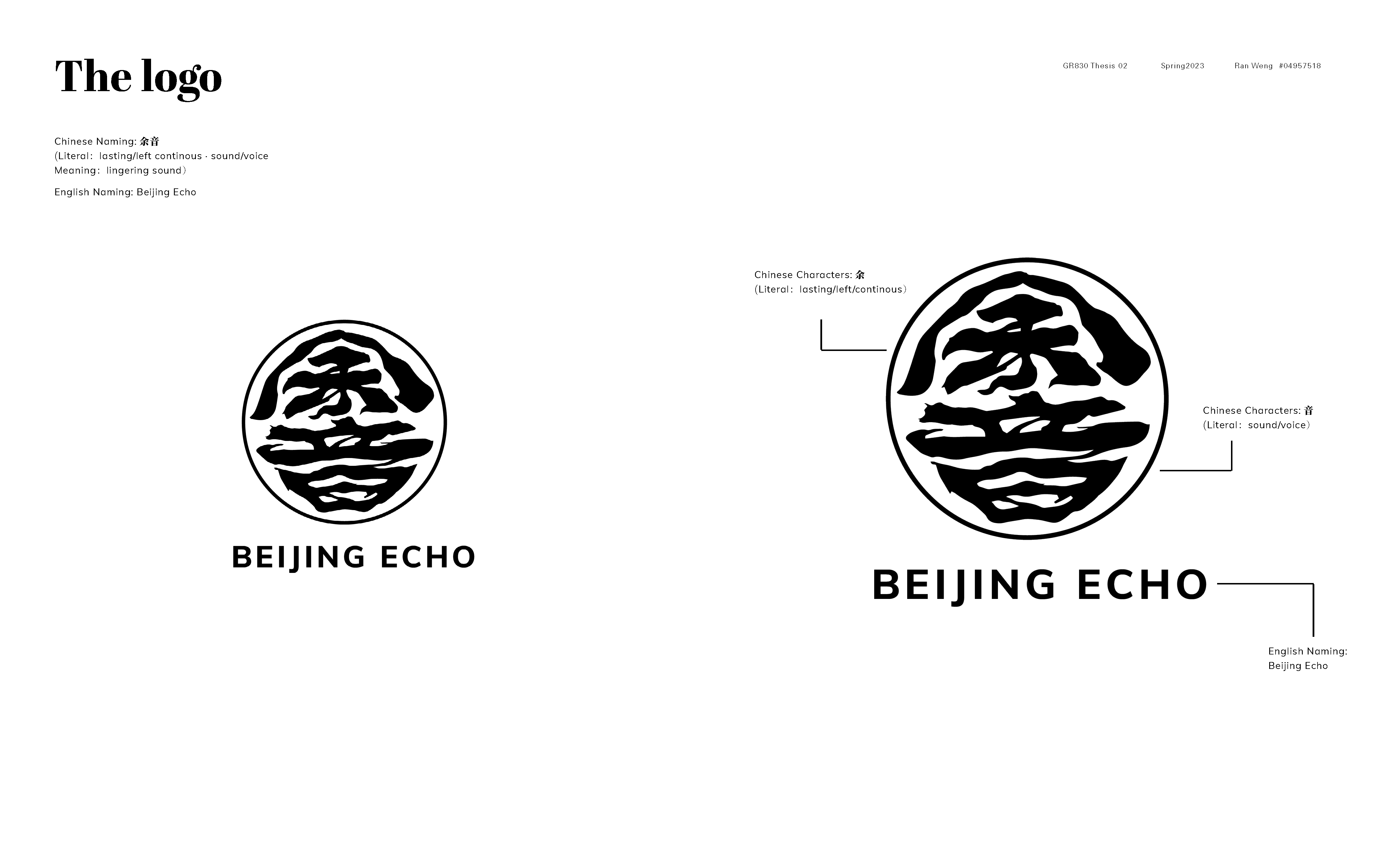
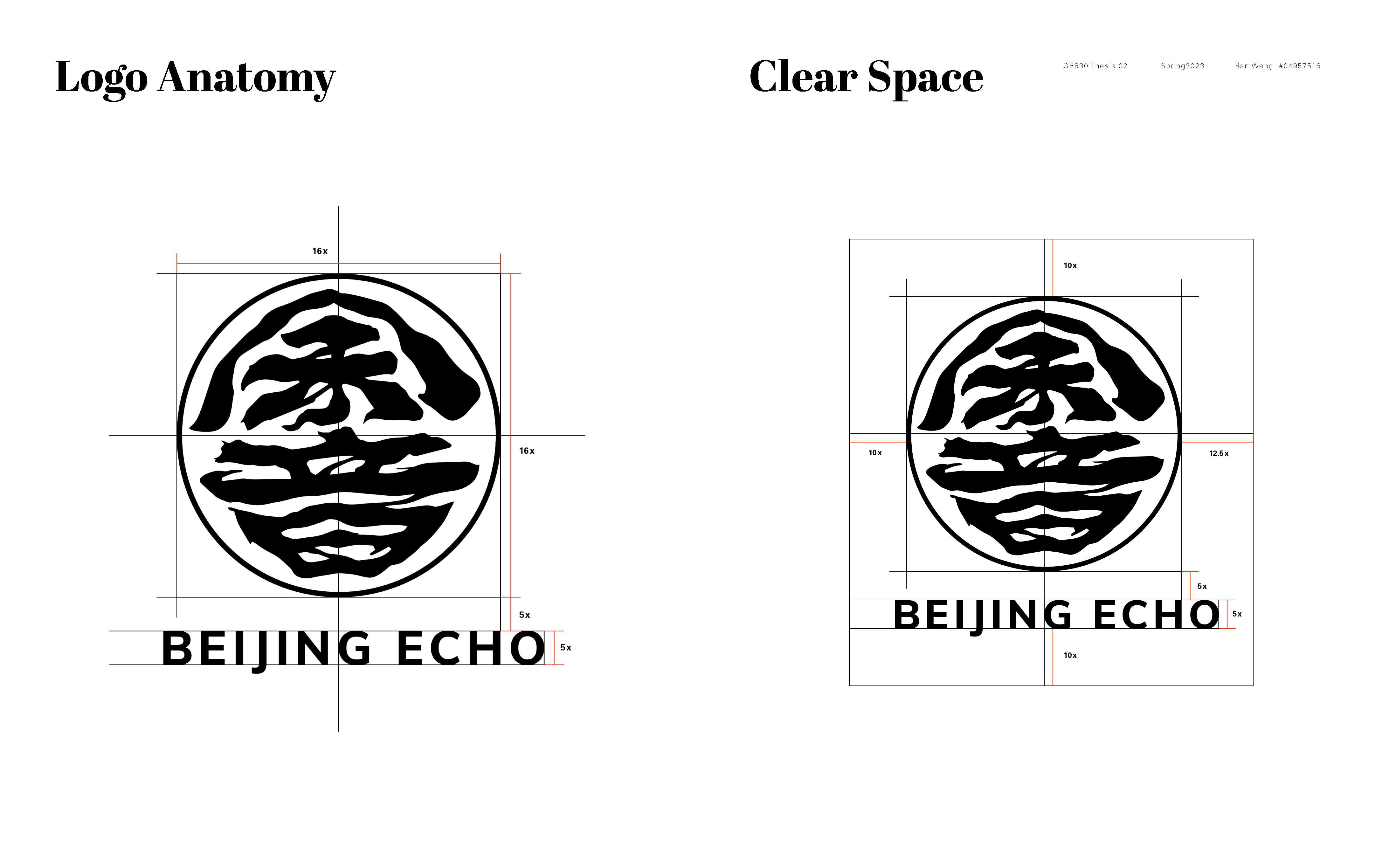
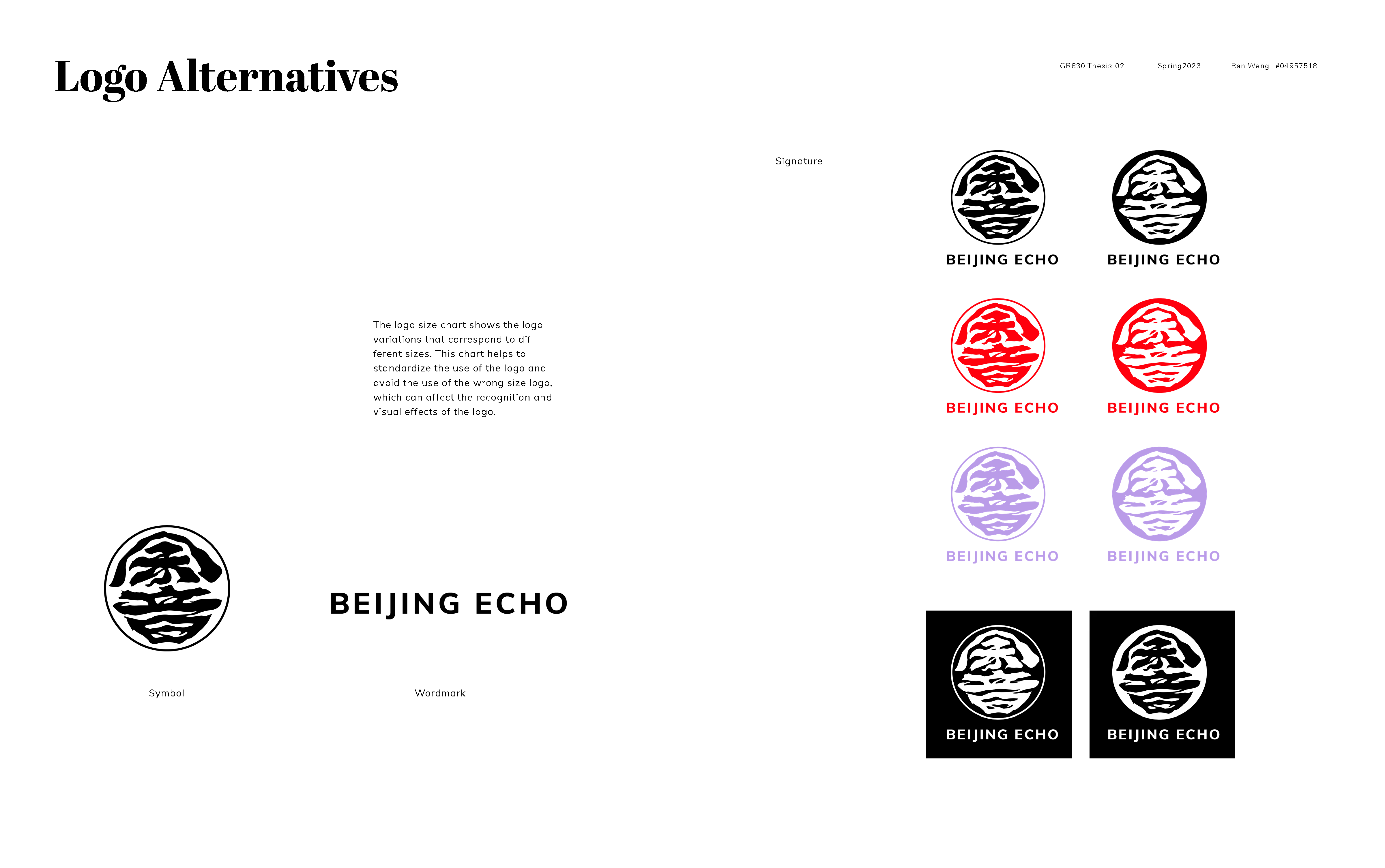
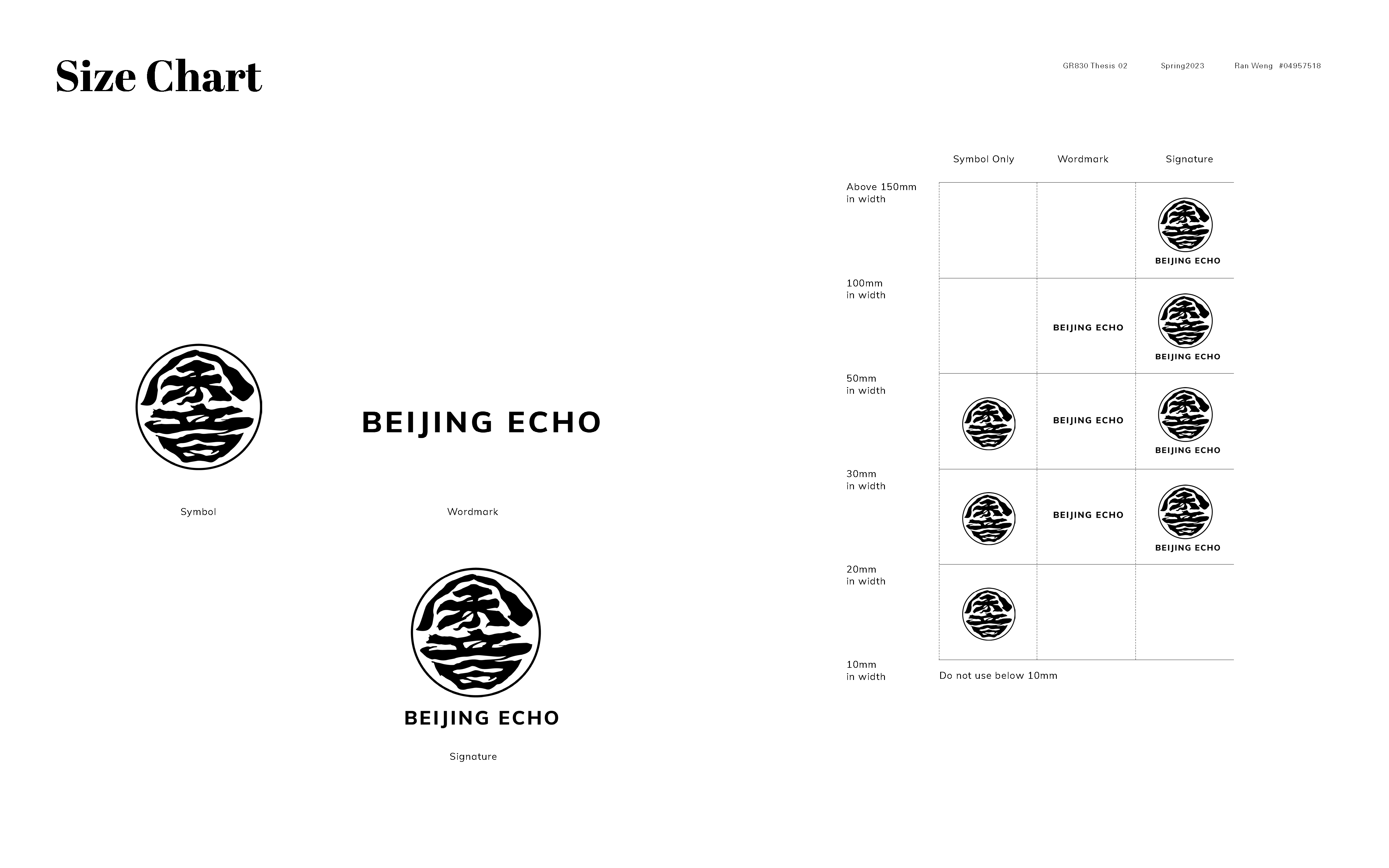
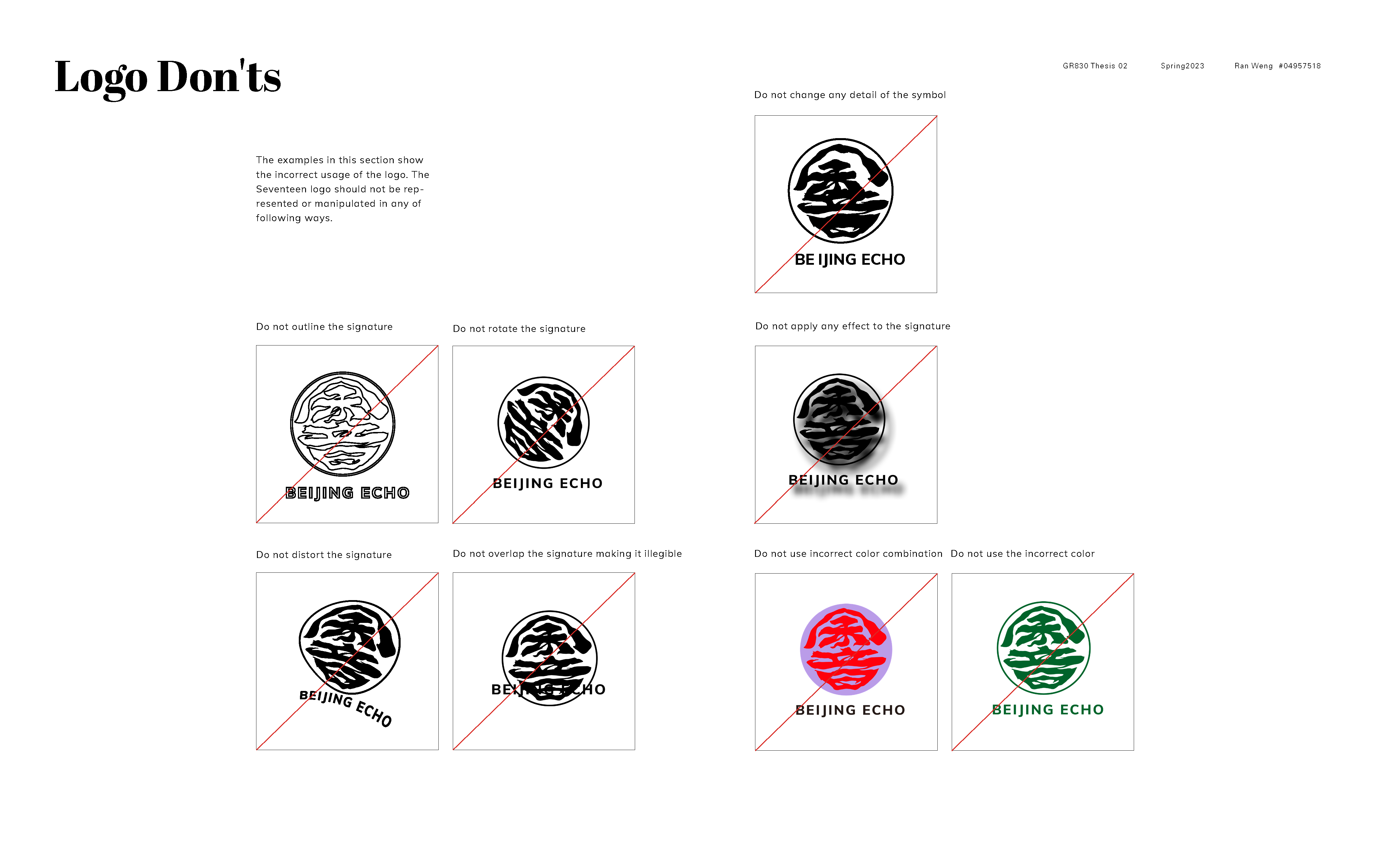
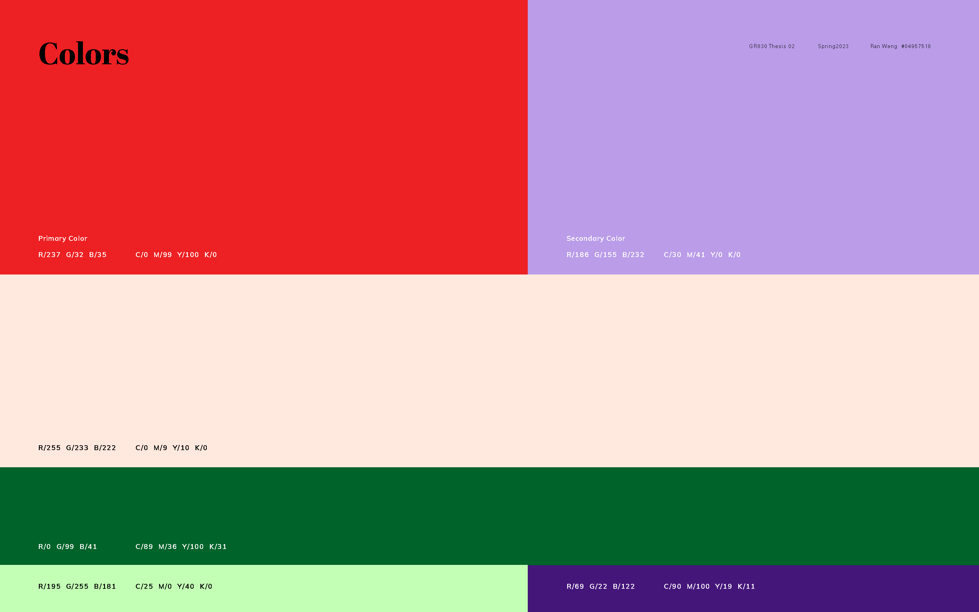
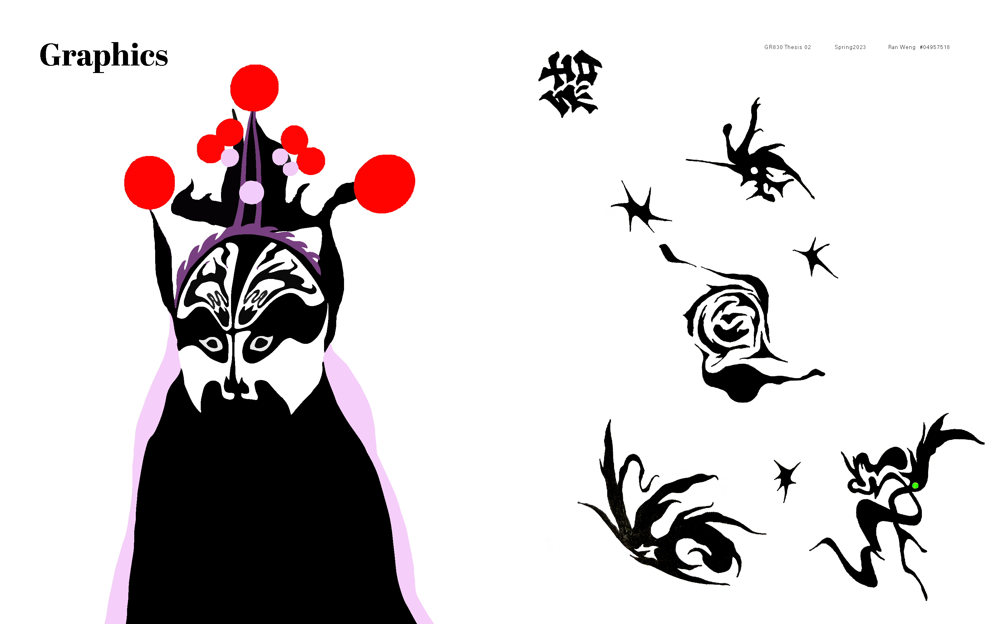
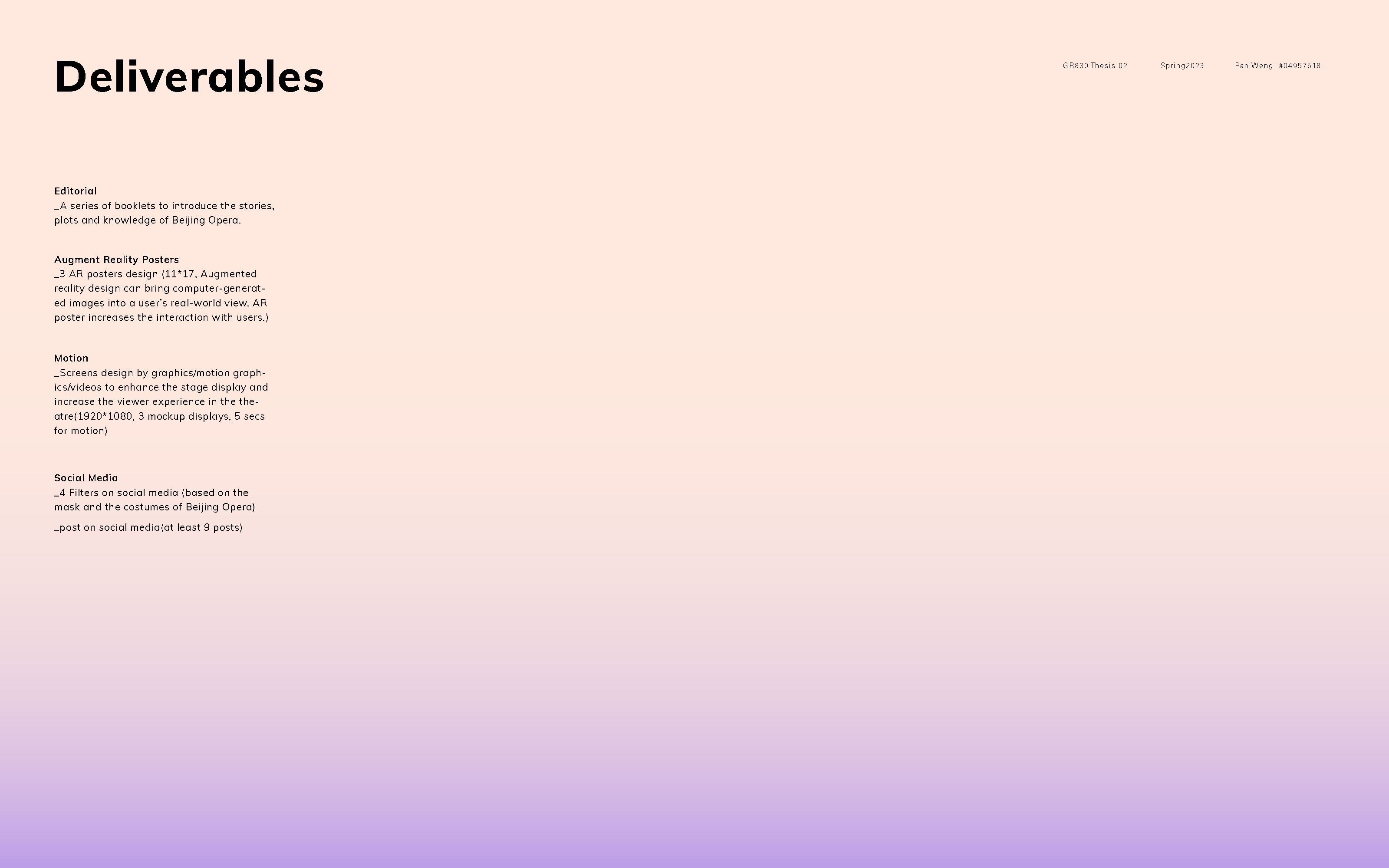
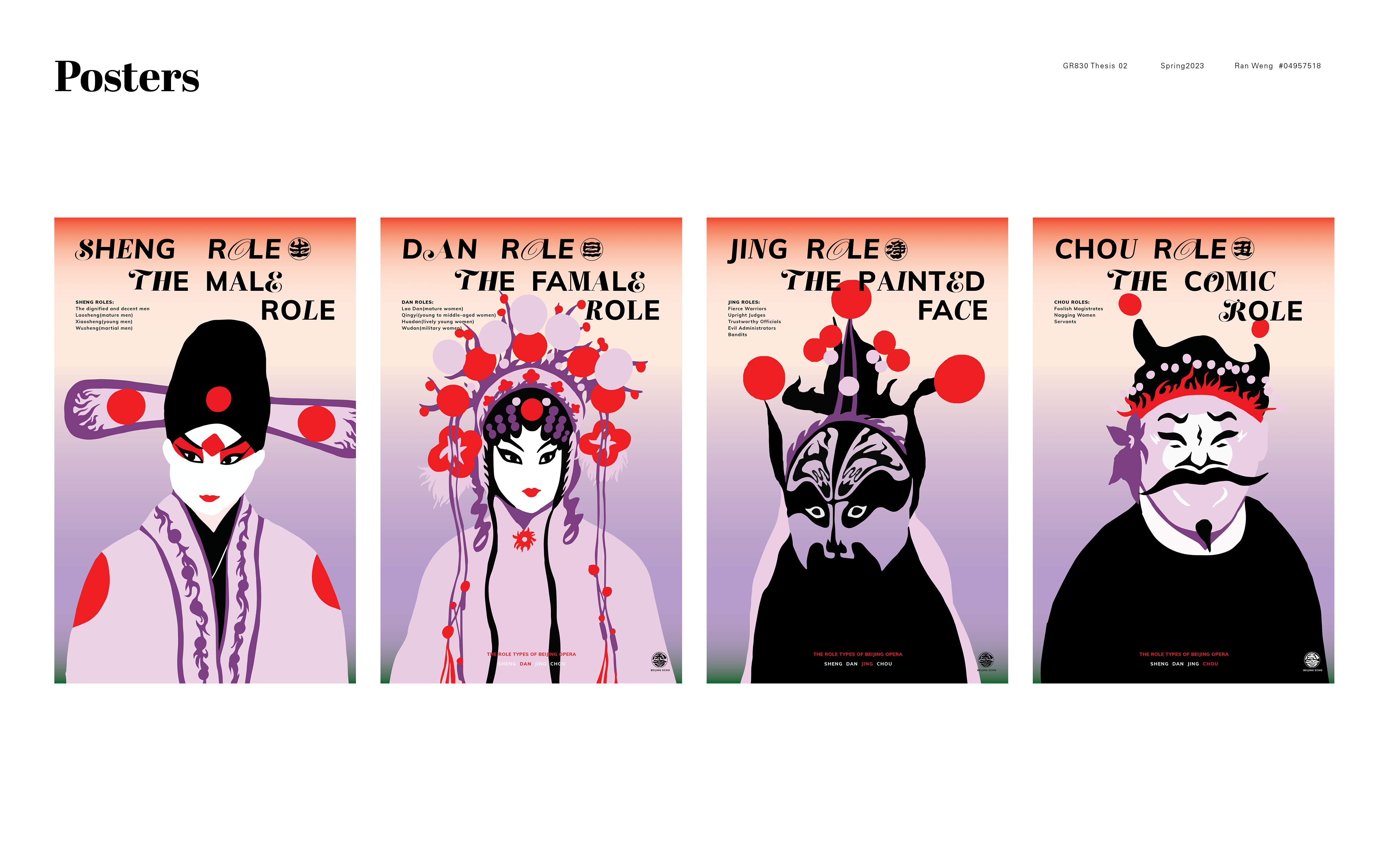
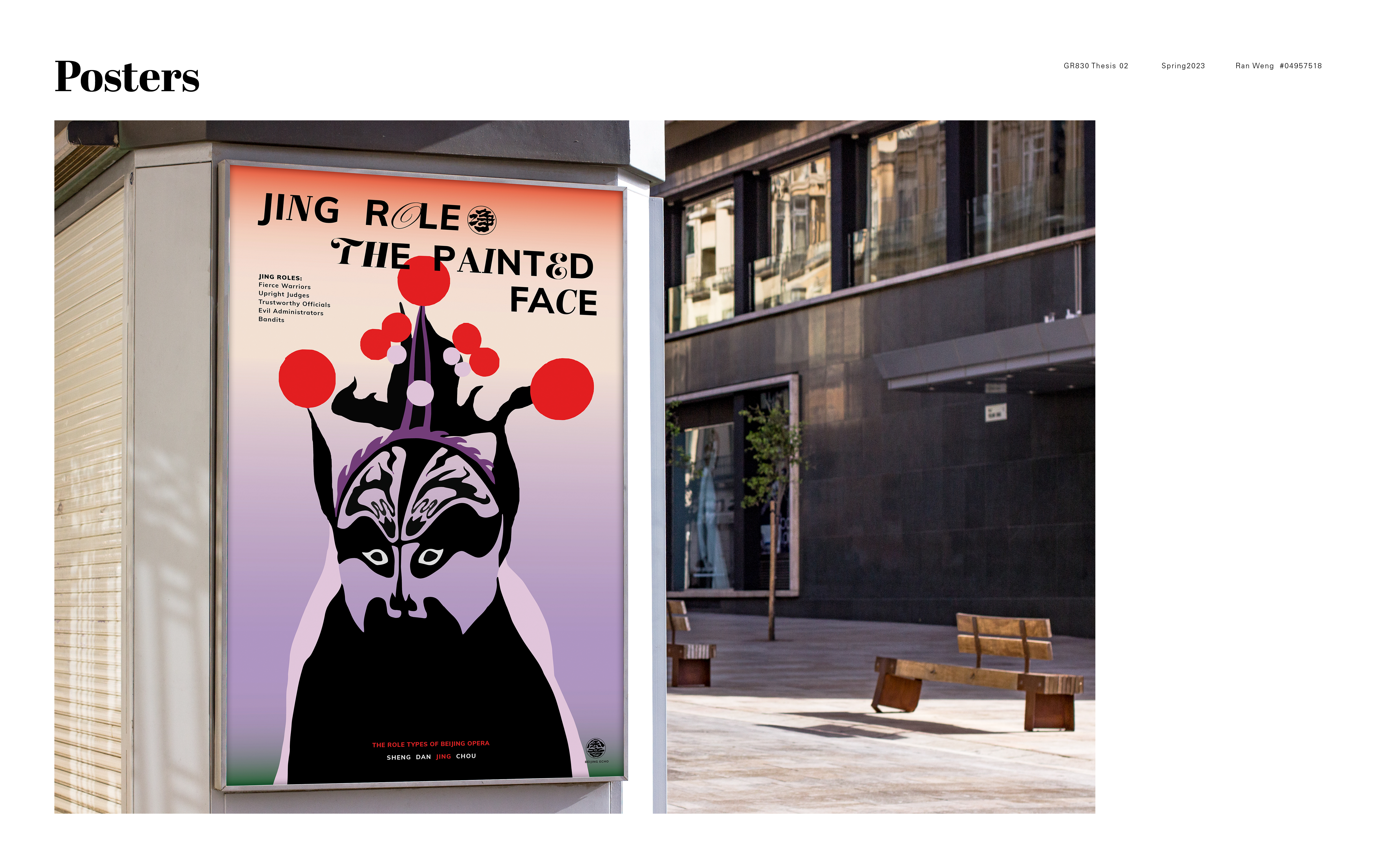
This week I wrapped up the process book. I divided it into three parts, the visual system guidelines, the deliverables, and the UX documentation. I chose to use the gradient colors as the chapter divider while leave the content pages between white background. I also decided to introduce the type compositions on the posters into the visual system, so I changed part of the title settings. There are more refinements of the details of the visual system guildlines. For the digital deliverable, the website, I changed some details and layouts. I know it has space to improve but this is what I have got so far. I hope I can add more illustration elements on the web as soon as I create more.
For the AR posters explorations, I keep testing the possibilities of all variations, including the type layouts, and colors and the movements. There are few approaches to do the AR effect. And I think the most work solution is to overlay the big type on the illustrations, so there are two to three layers when it come to live.
