WEEK 05
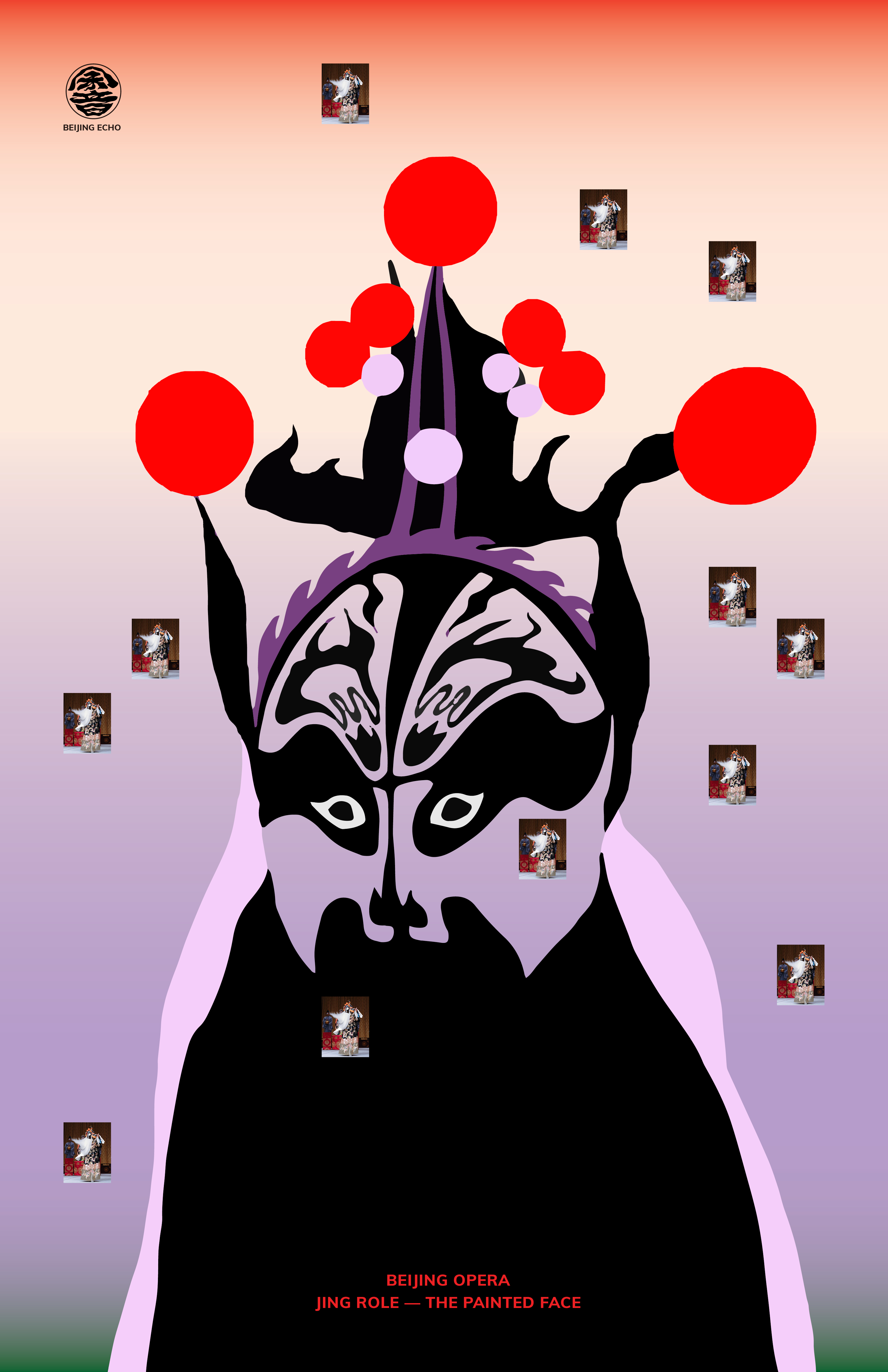
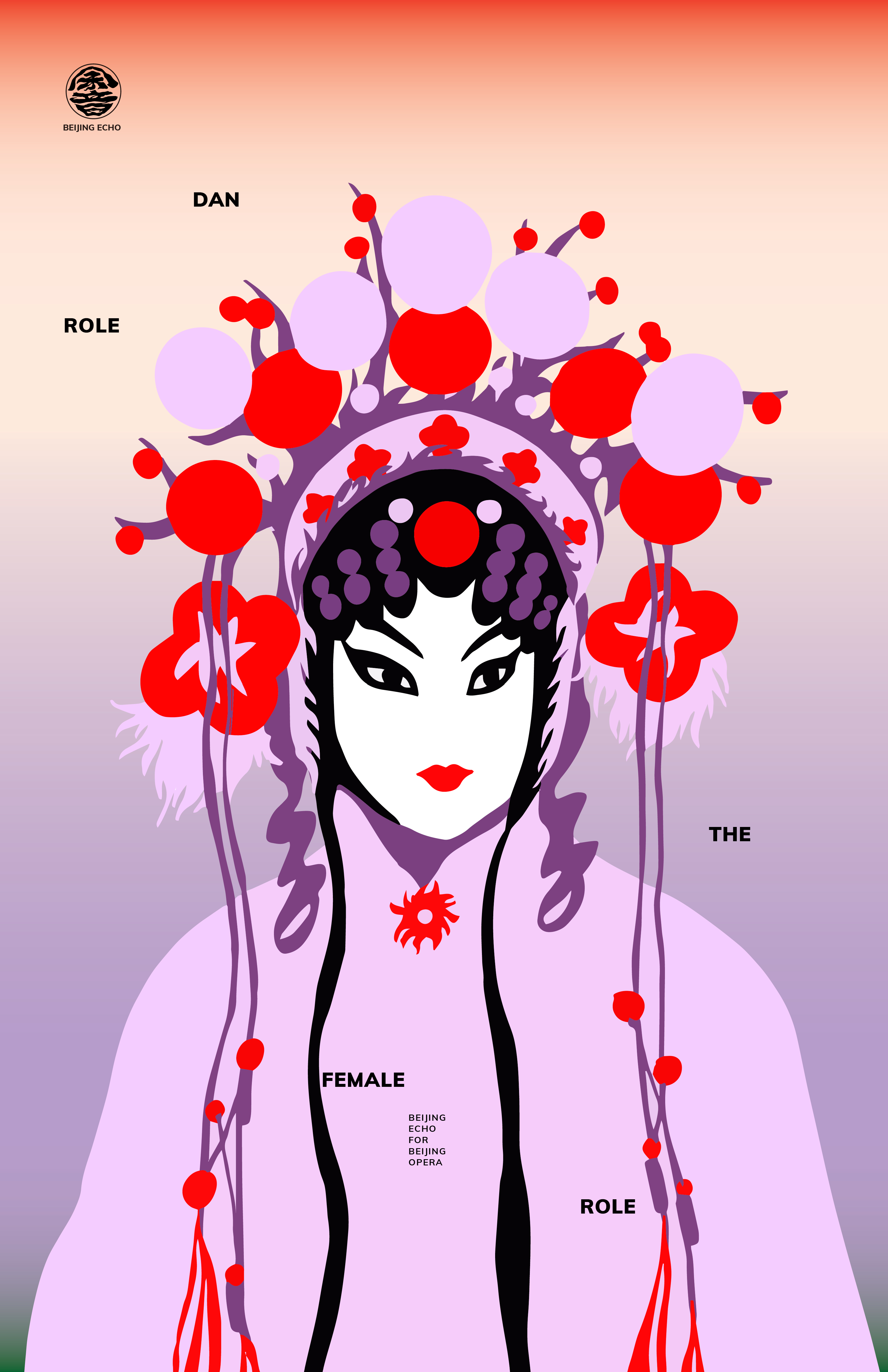
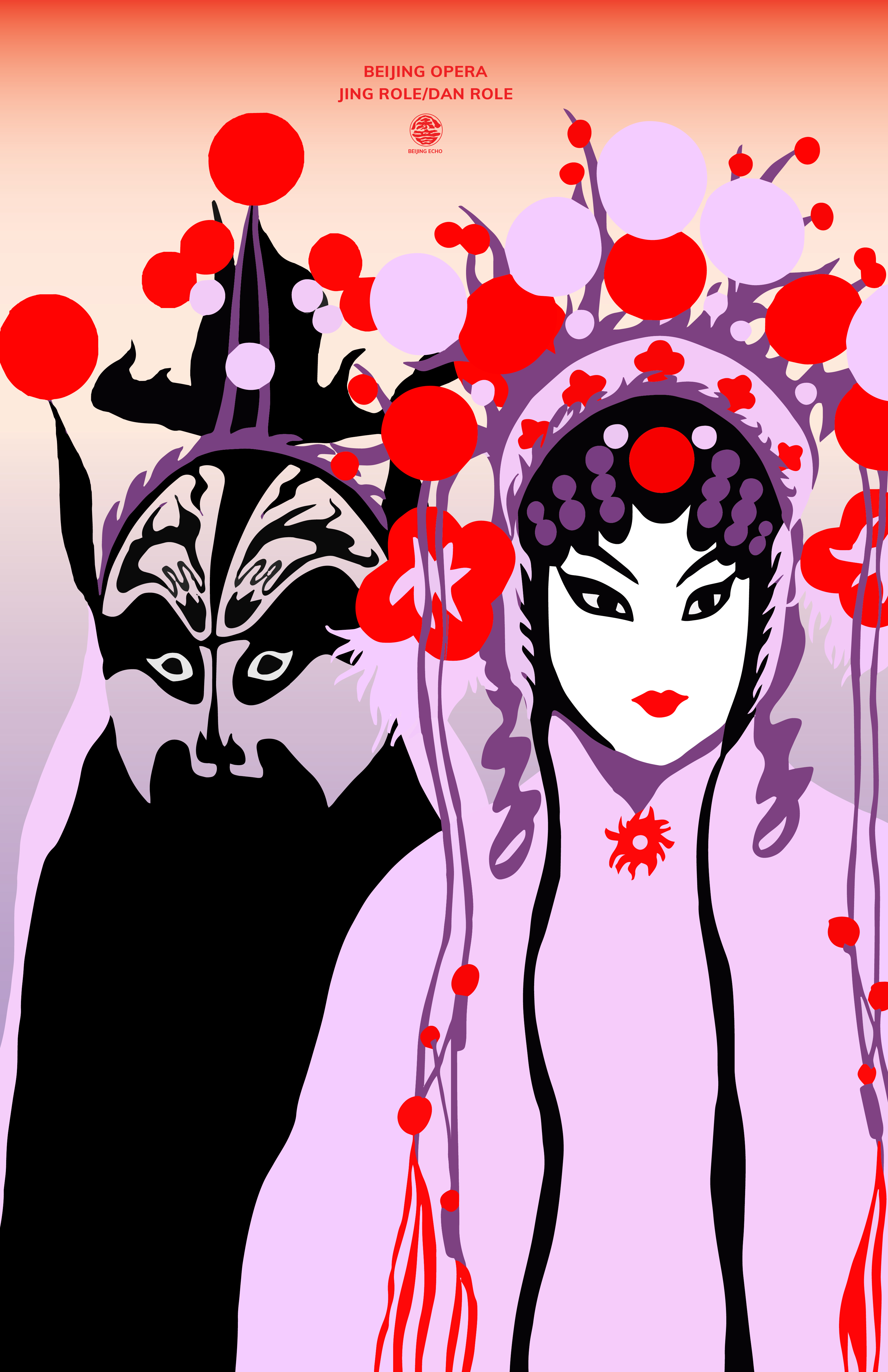
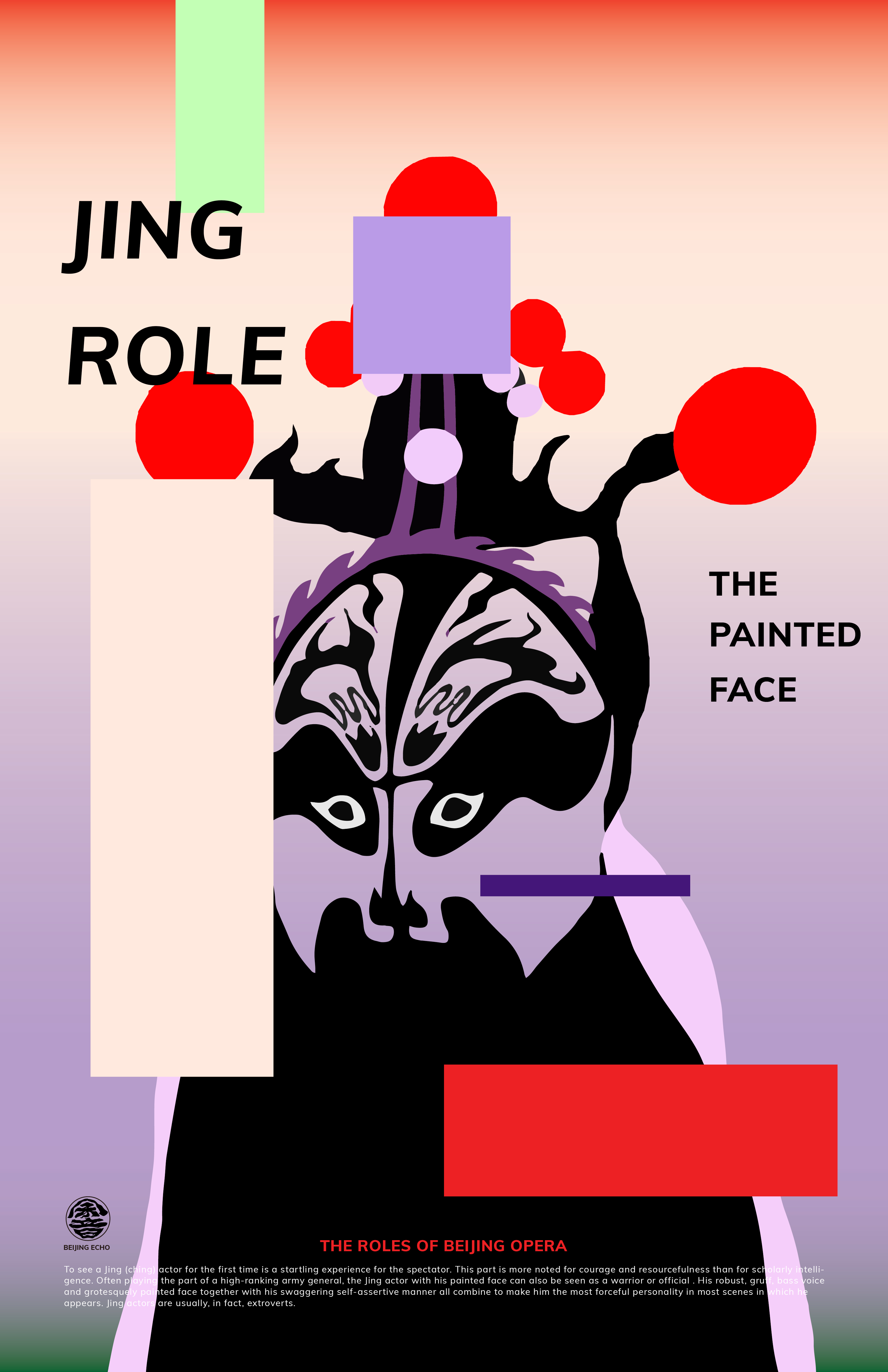
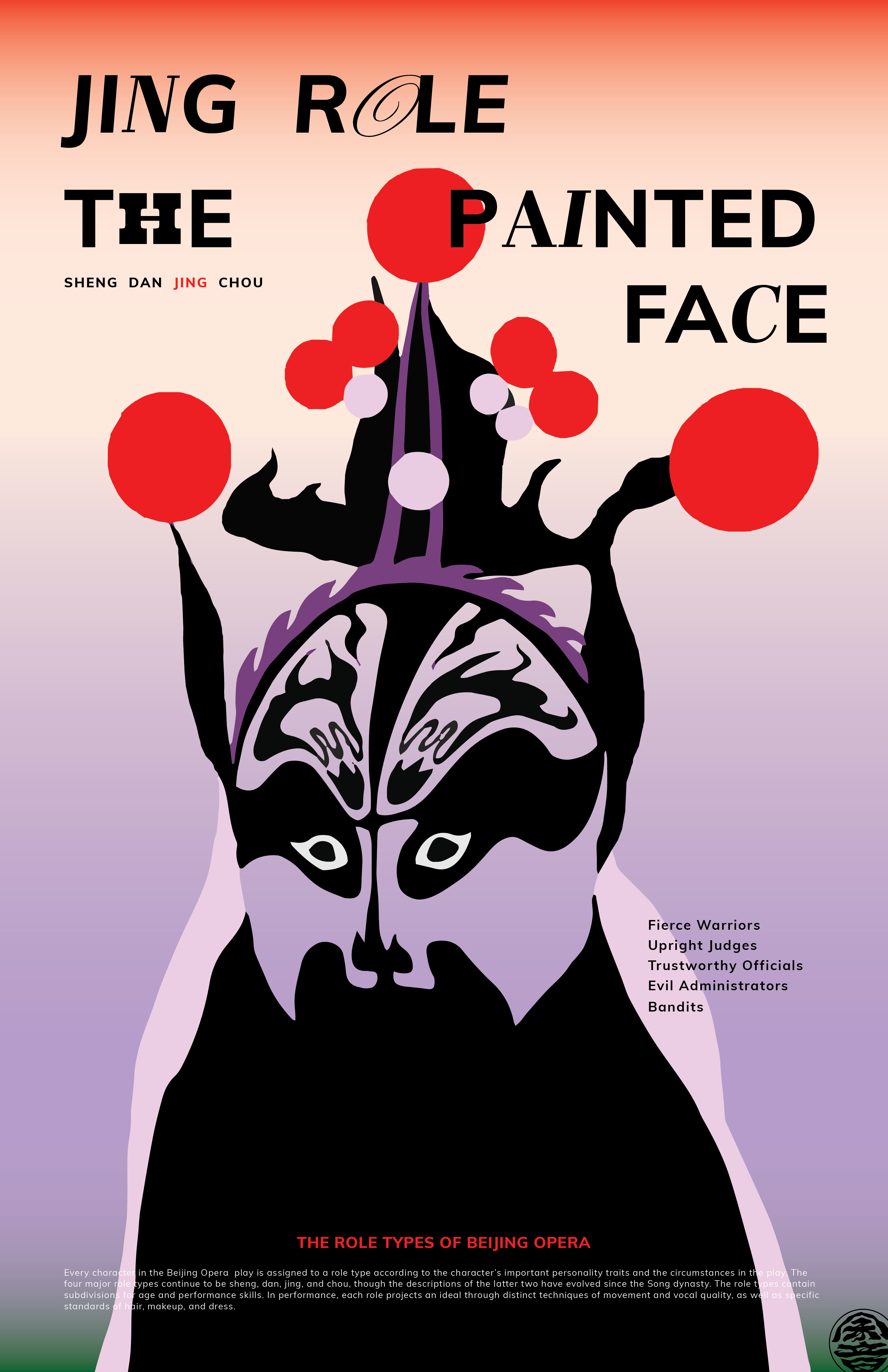
This week I kept refining the posters, including the typefaces and the layouts. After explorations, I finally decided to use the big types version for its clarity, cleanness and boldness. I changed some of the typefaces to make them fit the illustration better. I think I will use the big type in the visual system for consistency. I also did some keyframes for the motion part to see the overall outcome.
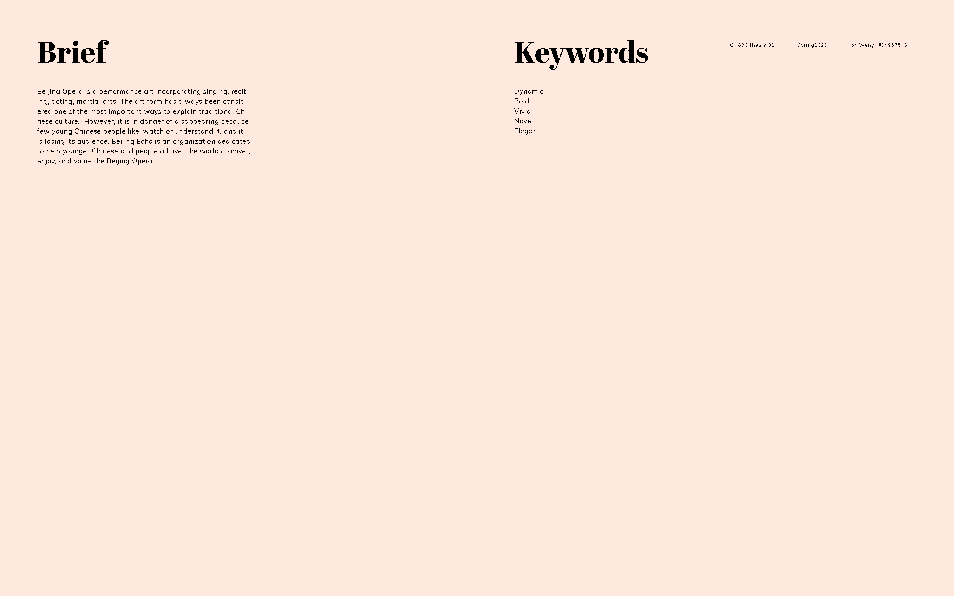
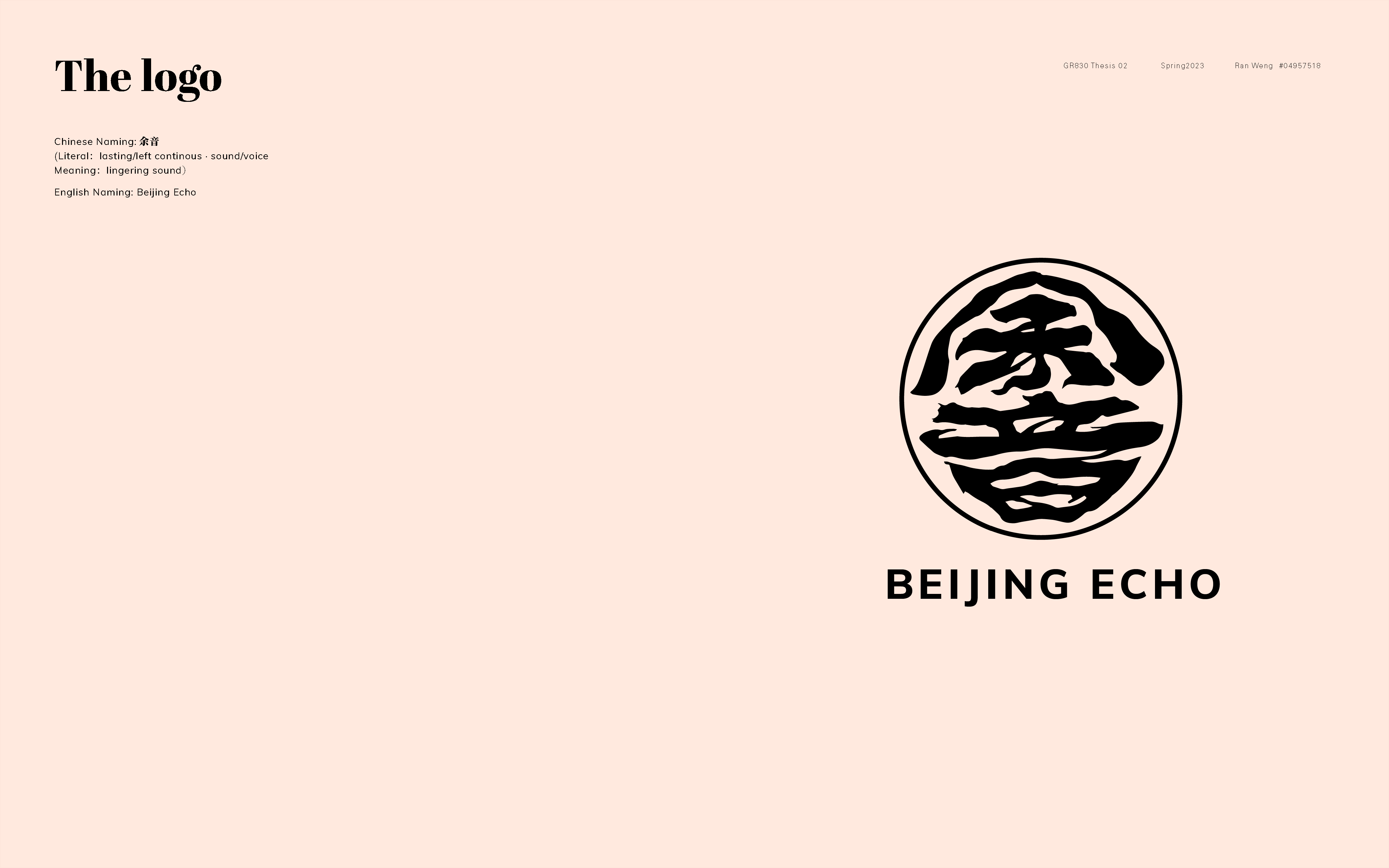
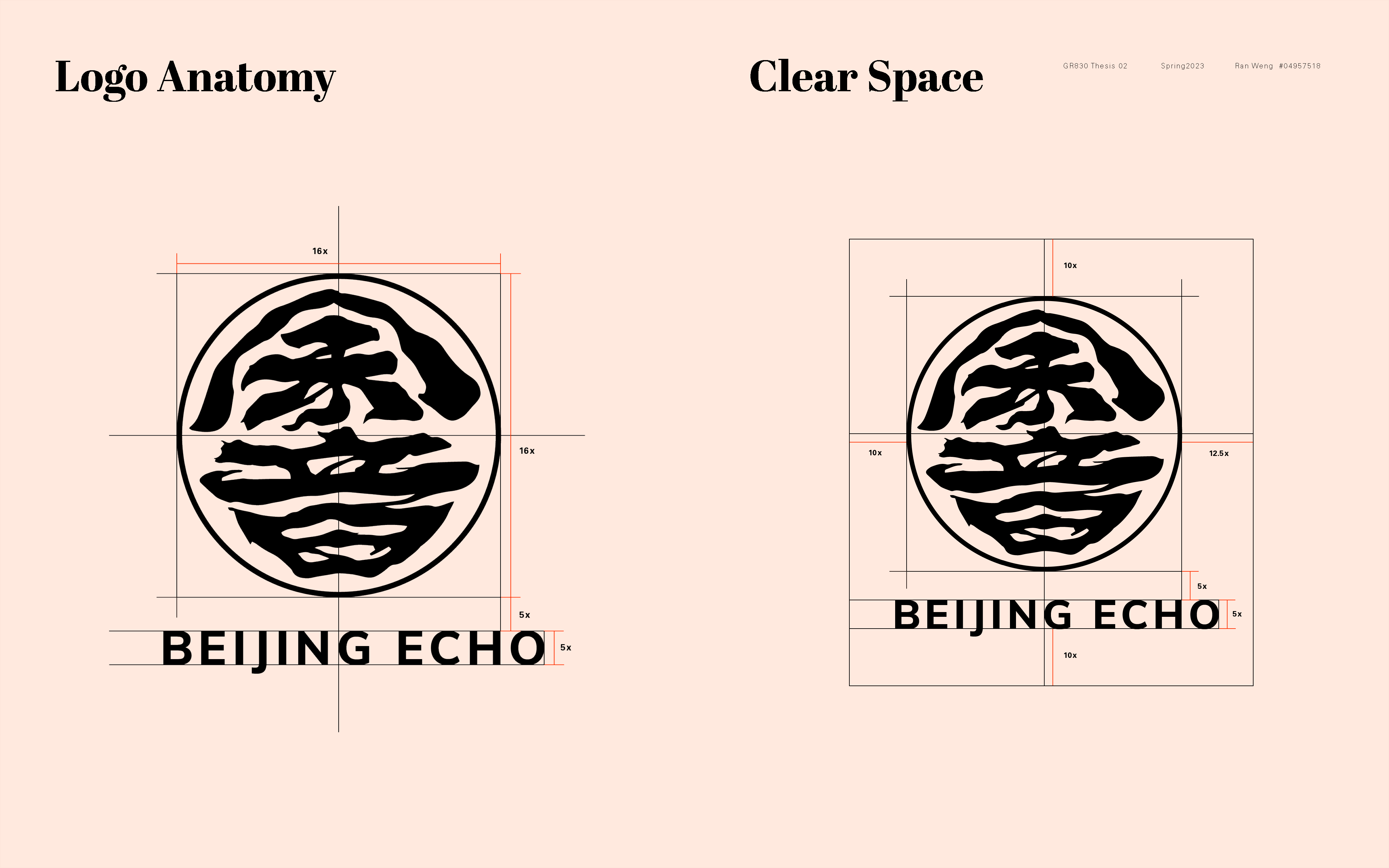
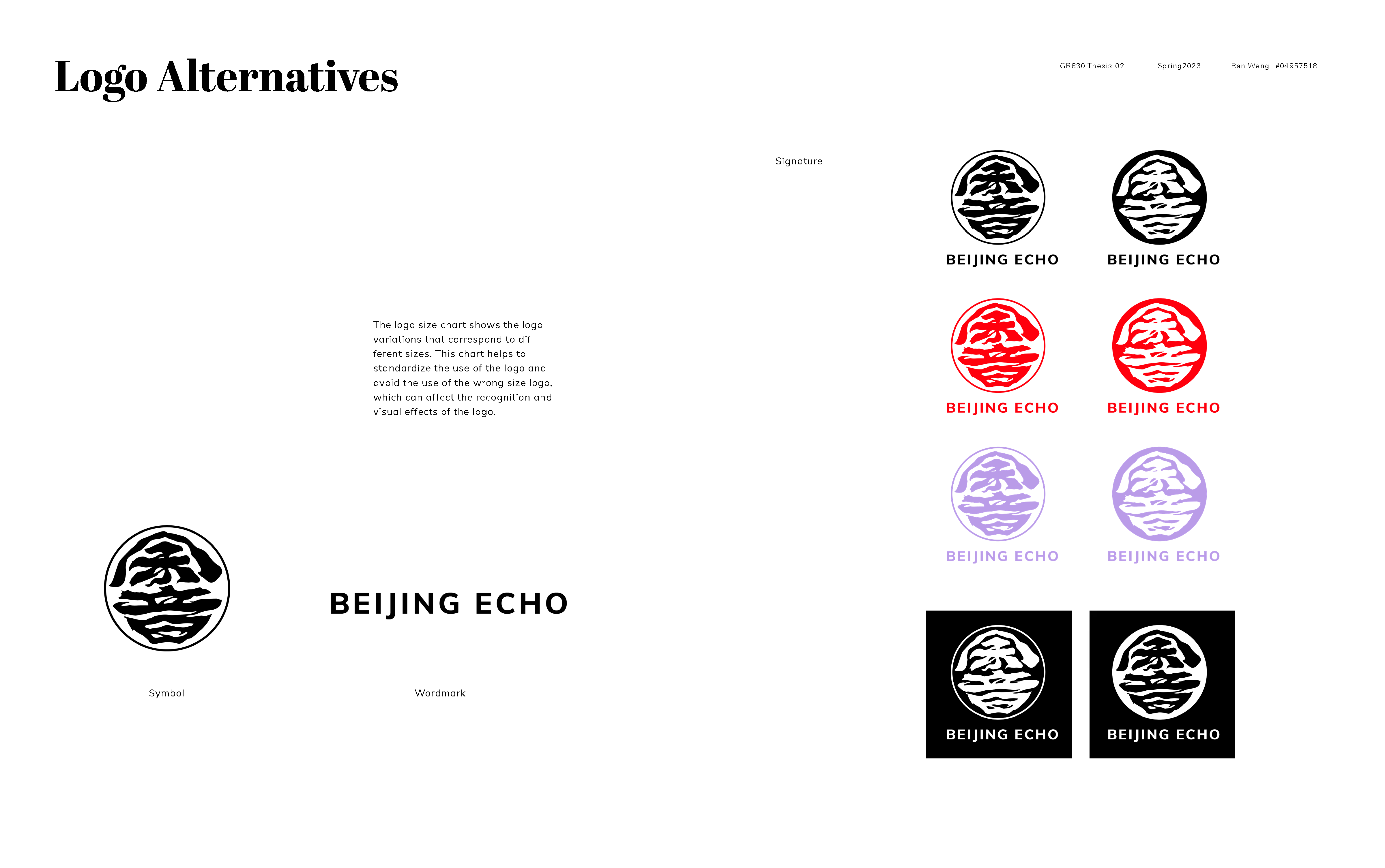
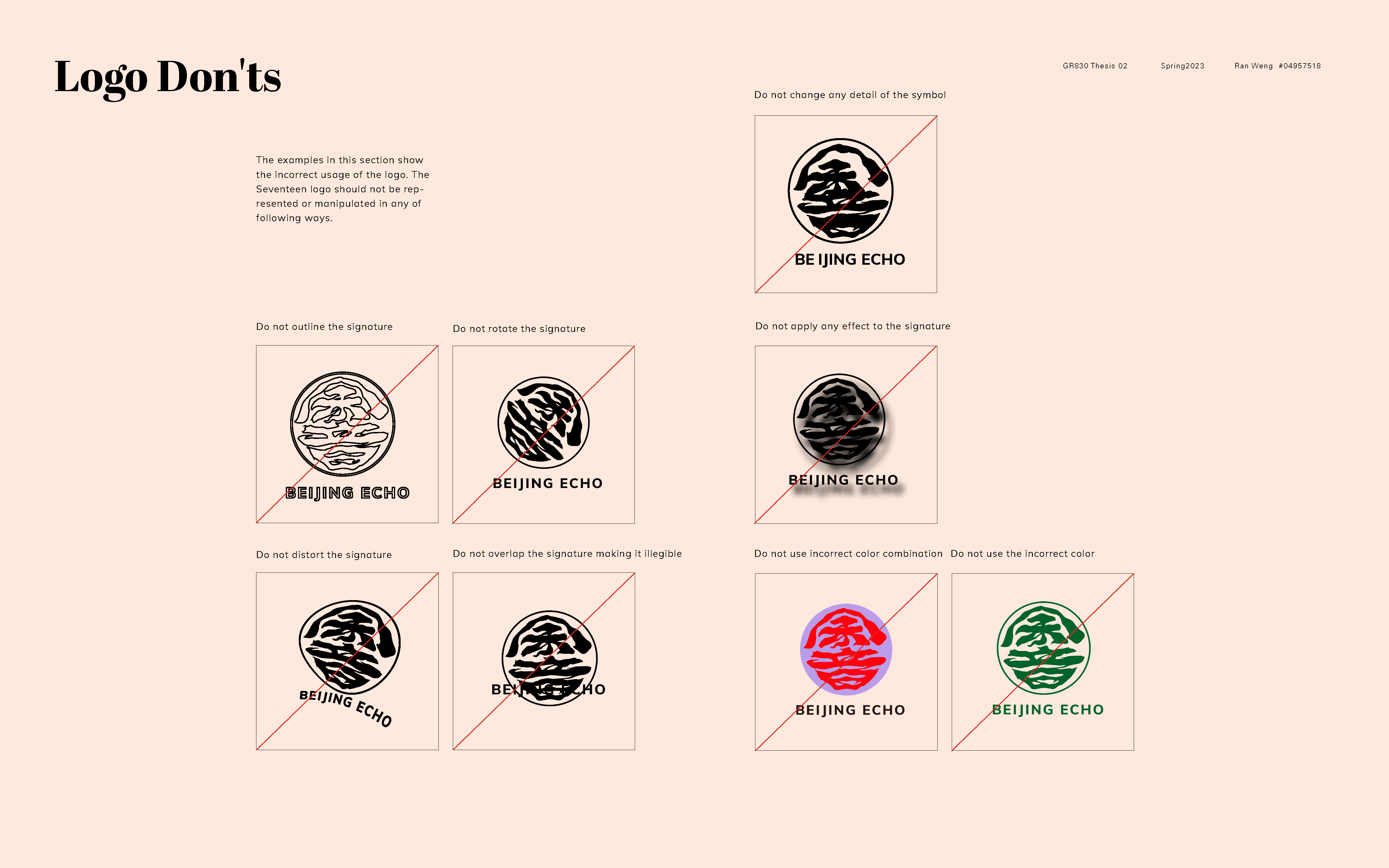
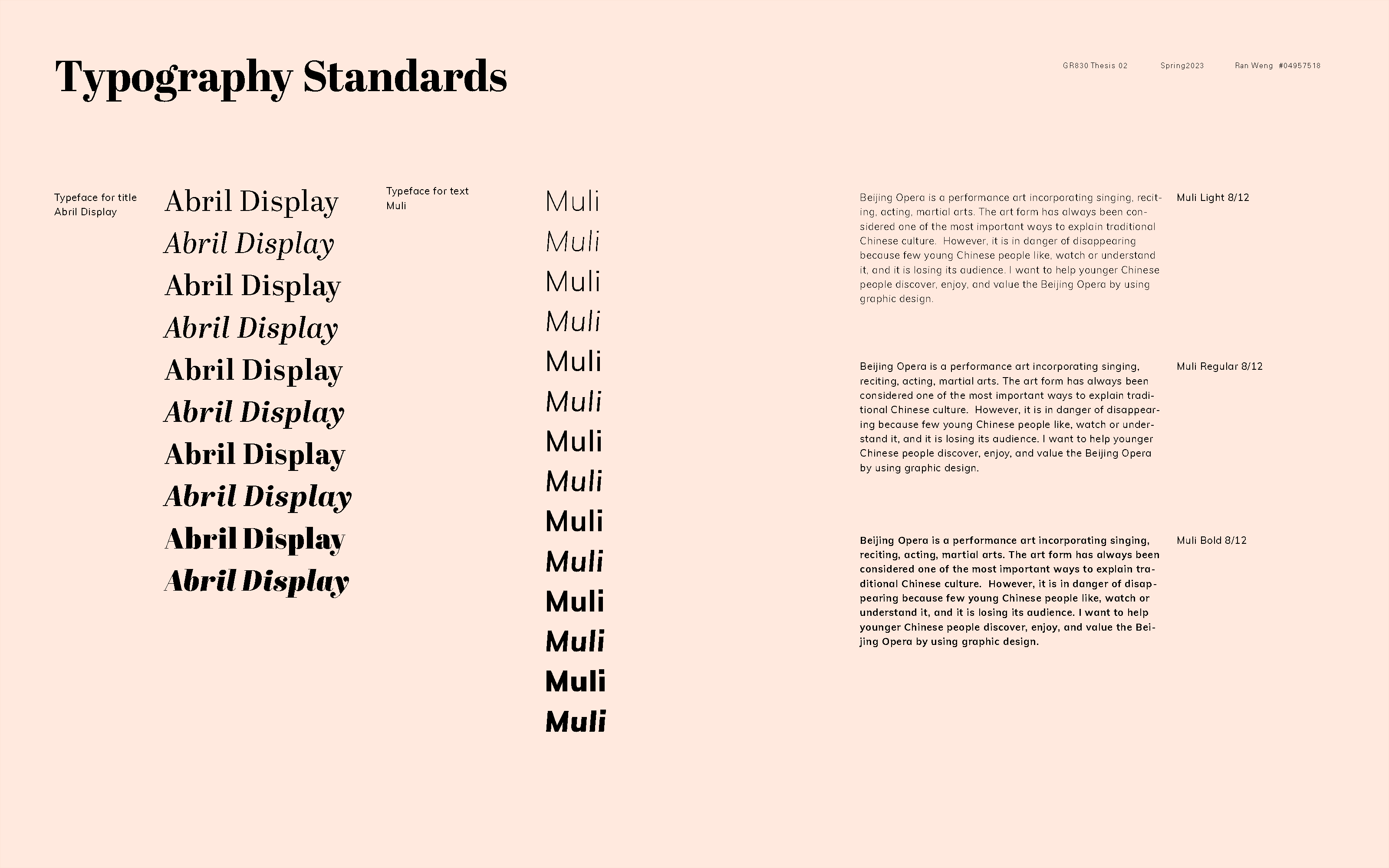
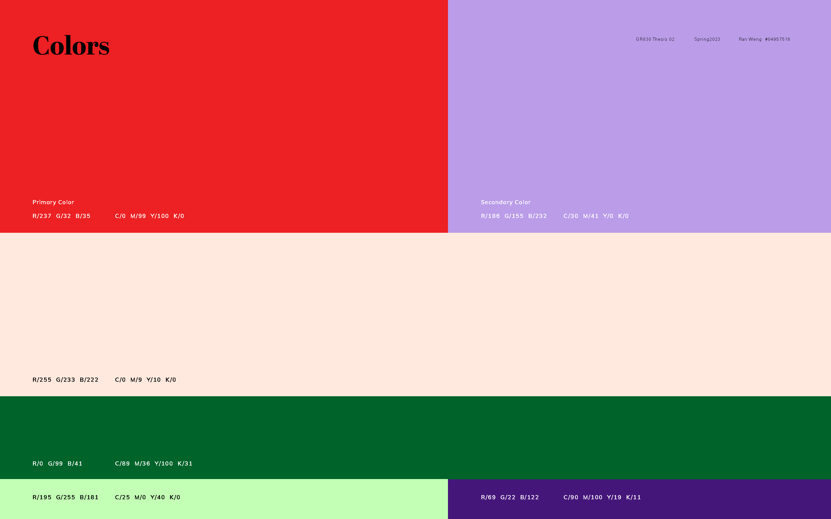
For the visual system guidelines, I started to add more content and details to enrich it. I also made tiny changes to my logo just to refine the details. For the next week, I hope I can wrap up everything about the guidelines and focus on the motions of AR posters.
For the visual system guidelines, I started to add more content and details to enrich it. I also made tiny changes to my logo just to refine the details. For the next week, I hope I can wrap up everything about the guidelines and focus on the motions of AR posters.

