WEEK 04
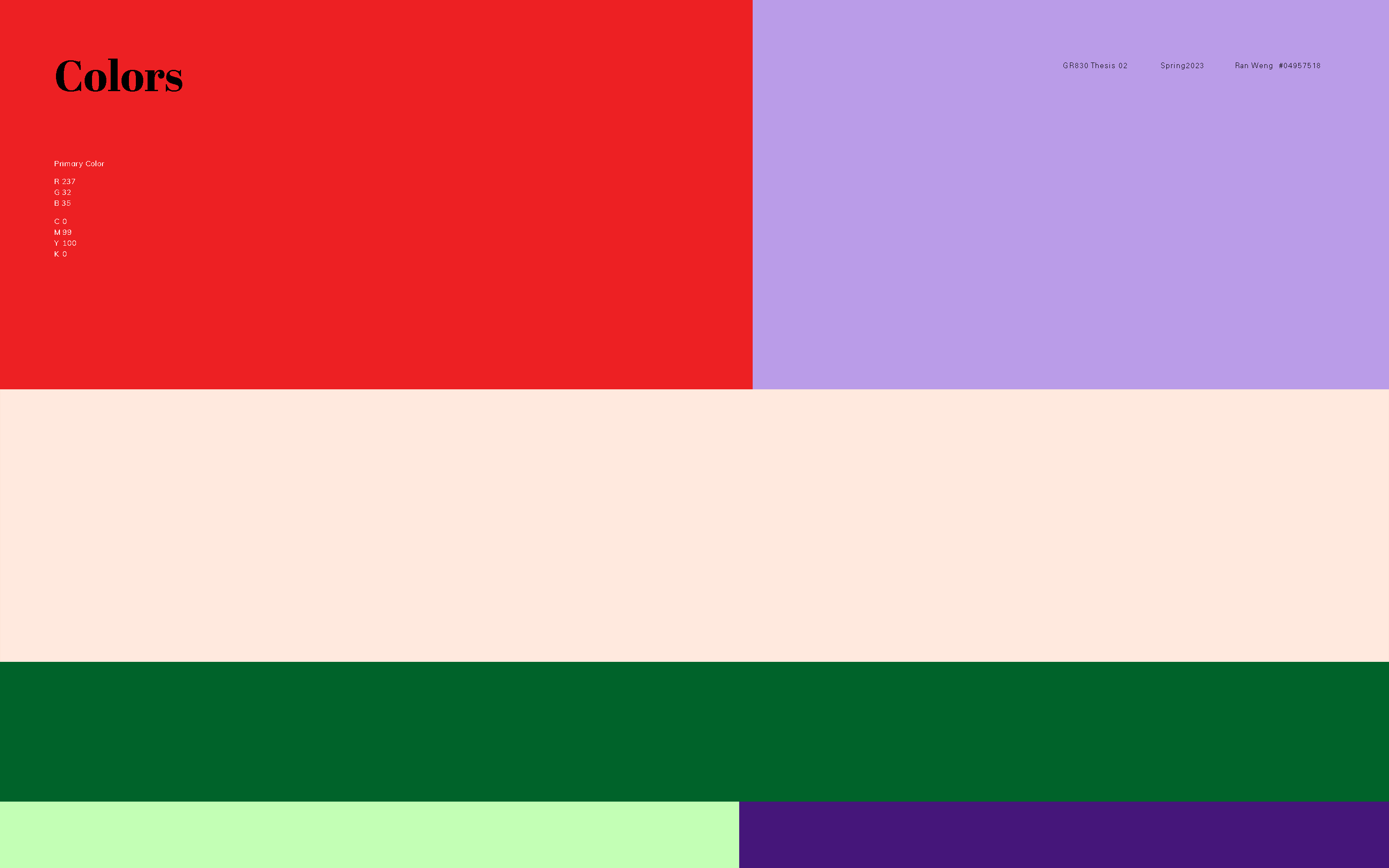
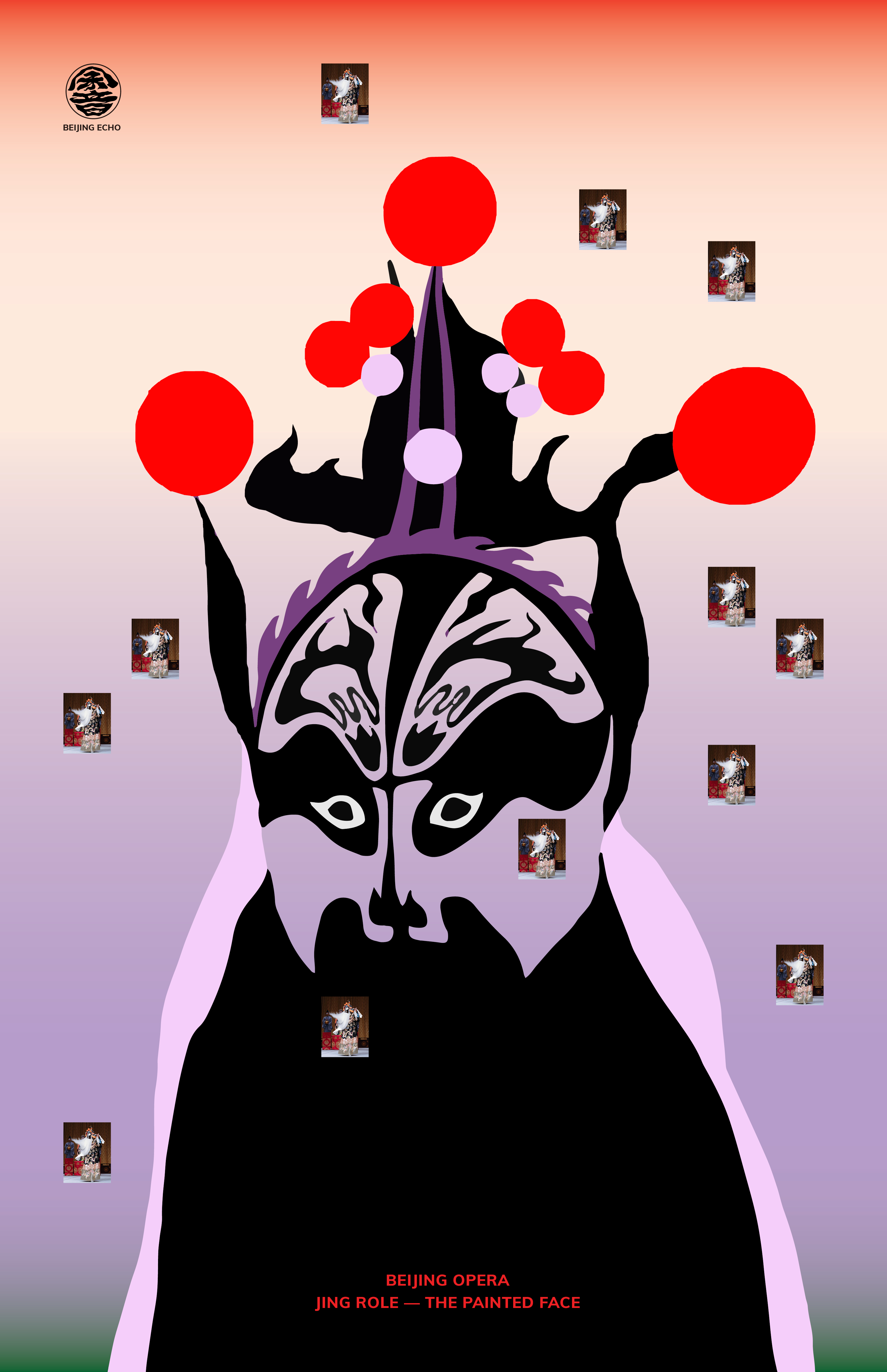
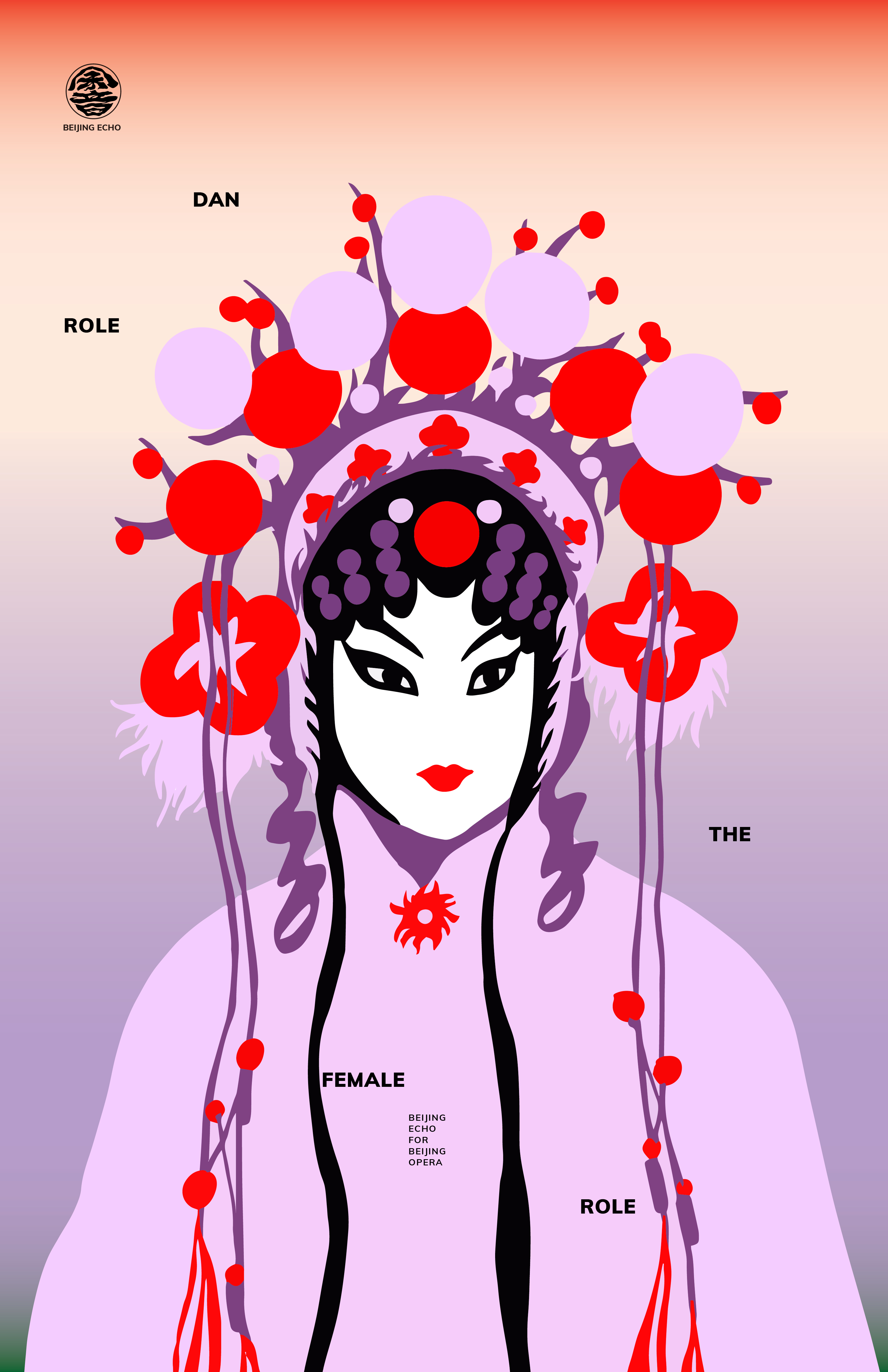
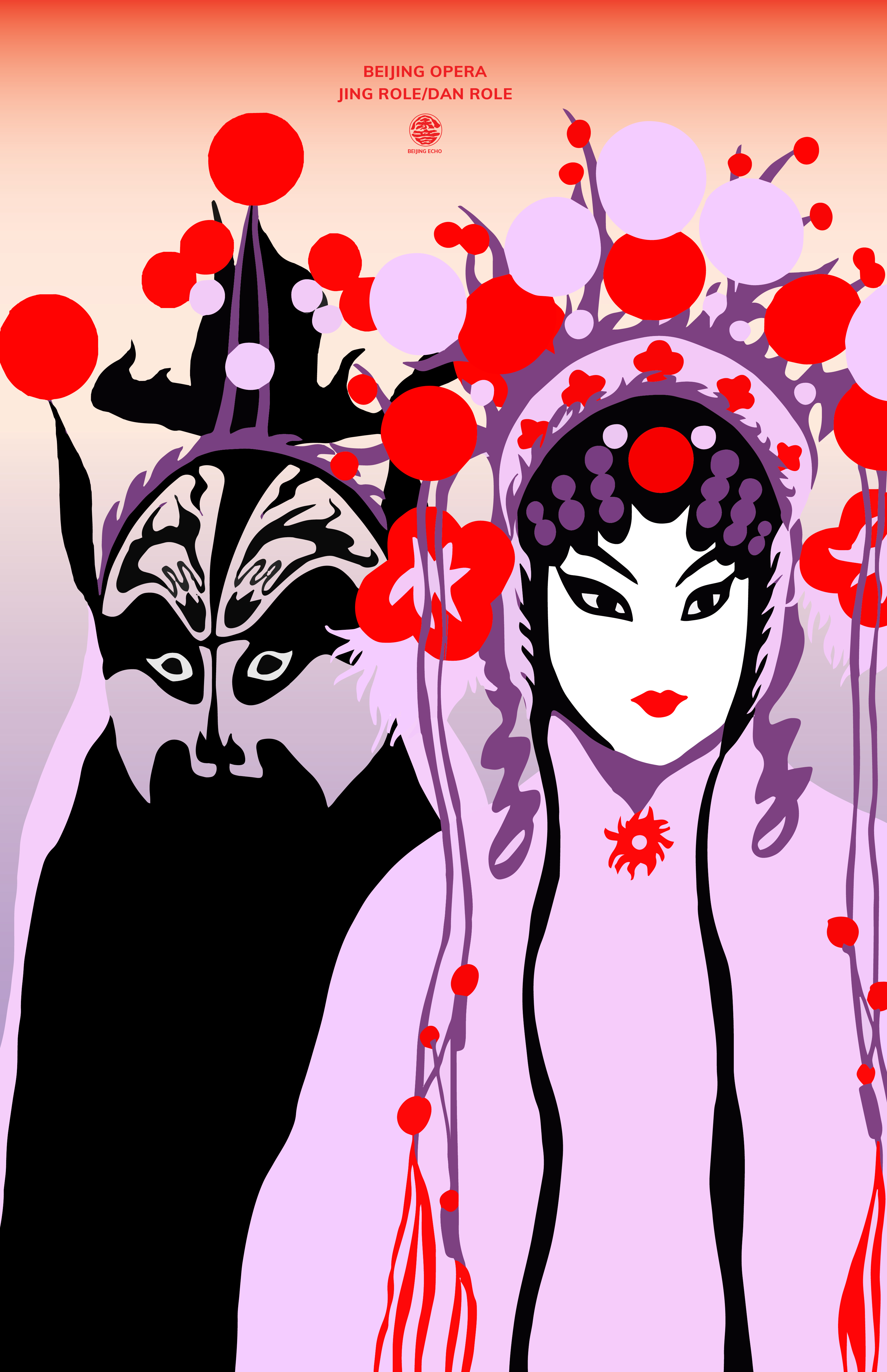
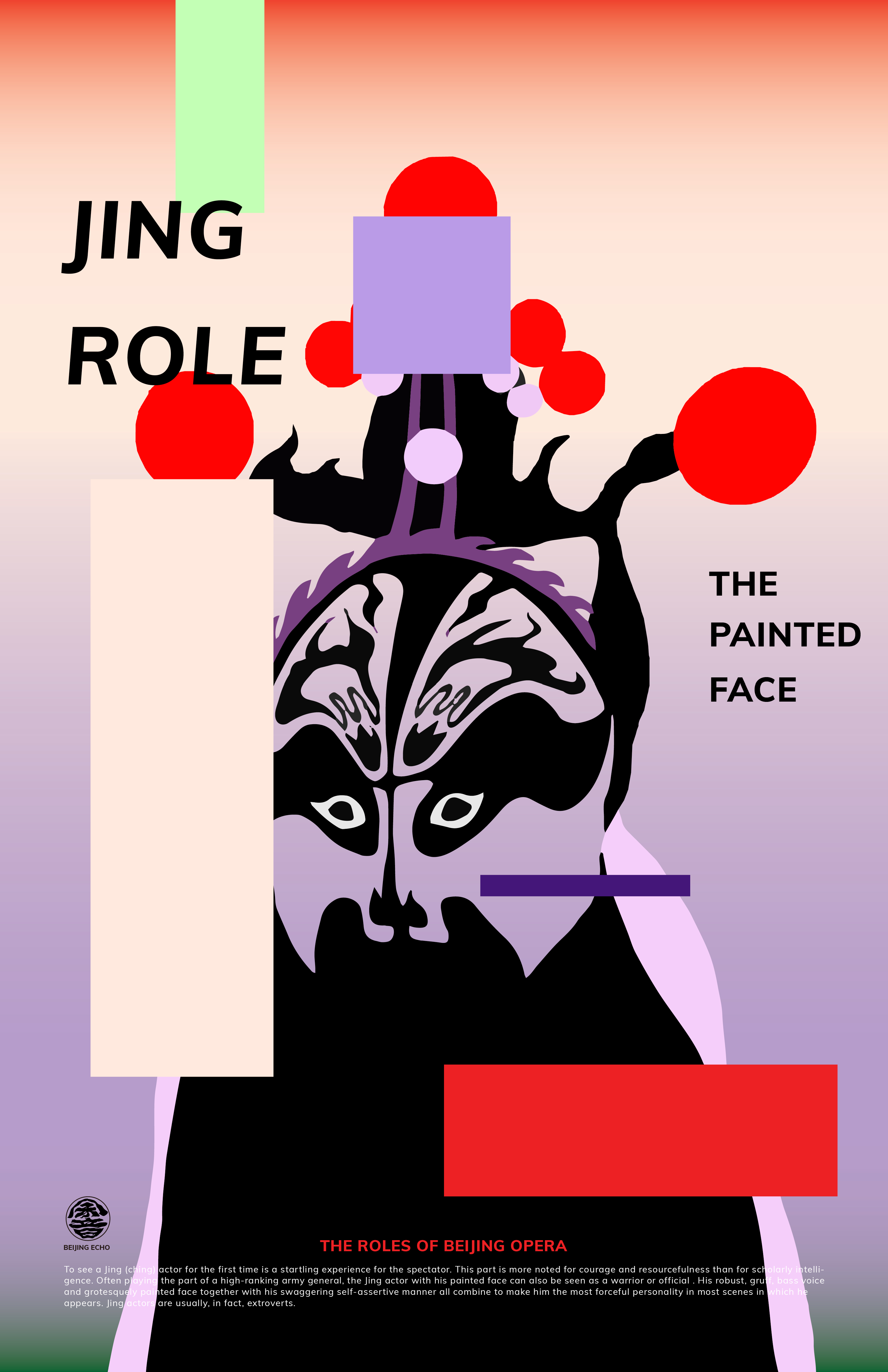
This week I kept exploring the posters layouts, colors, composition and typefaces choices. I think what I have tested on the posters will reflect on the whole visual system and help me better organize the visual system guideline later. These four posters aim to introduce the role of the Beijing Opera. Personally, I want to keep the posters simple and clean since there will be AR motions added to the poster. I tried to use different typefaces in one word and added one Chinese character (meaning jing role) to enrich the type. I also tried new visual interests and graphics.
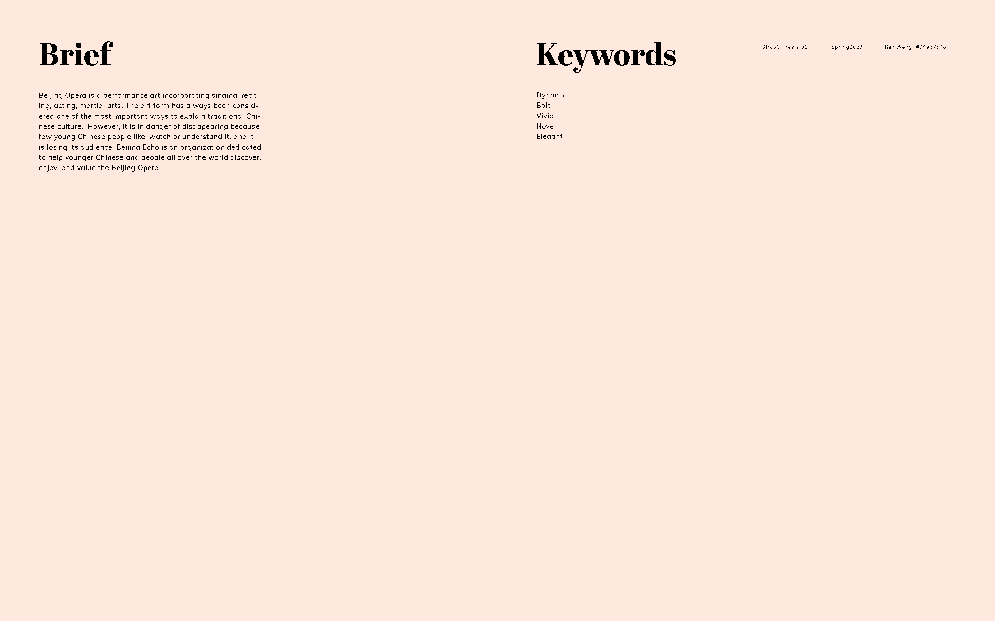
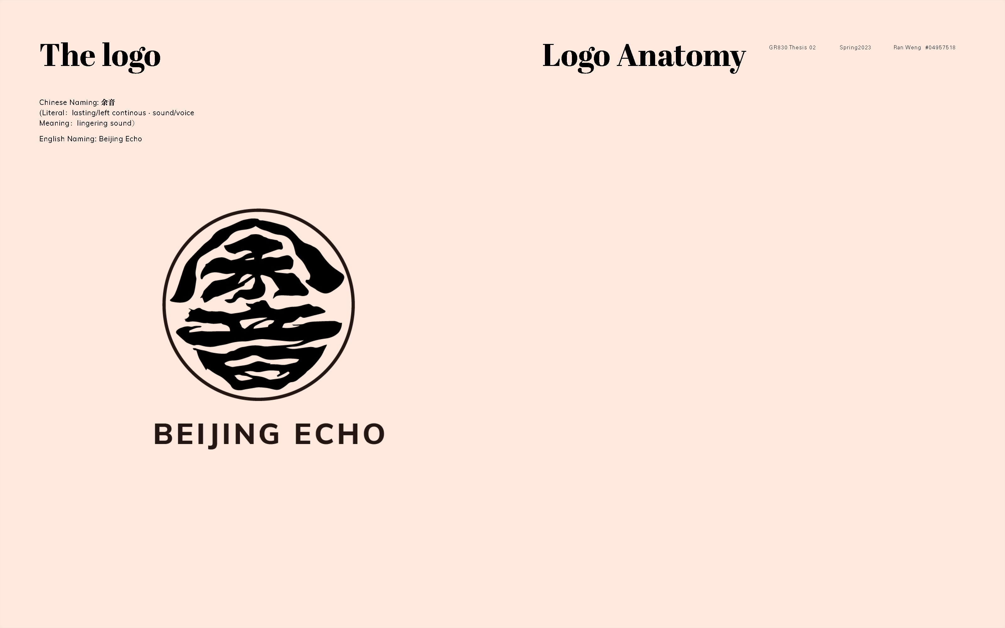
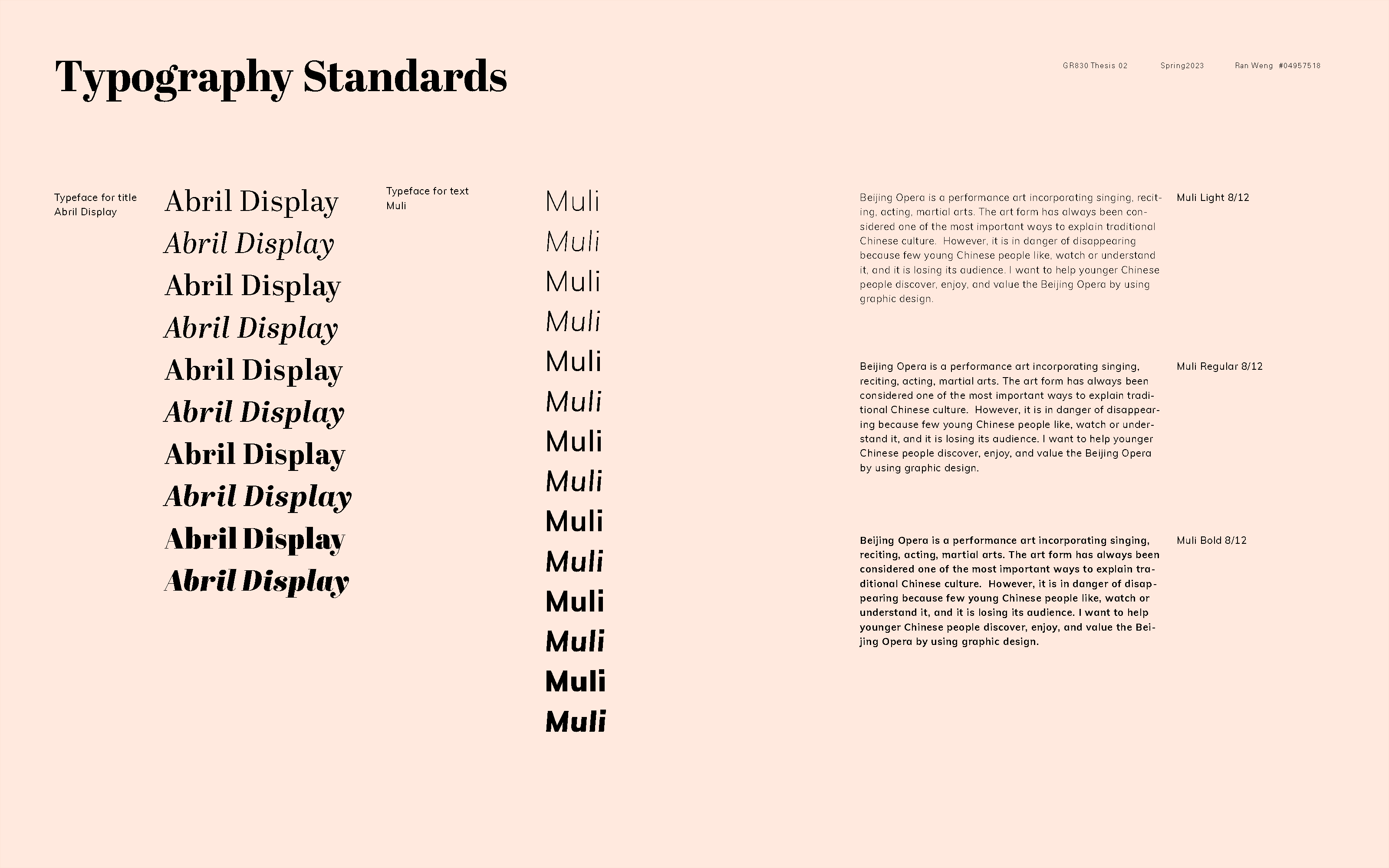
The visual systems guideline right now is still pretty rough and I will gradually refine it. Because I chose to use illustrations in my booklets at the very first, I had to add more illustrations to the booklets and other deliverables. So I will continue to create illustrations throughout the whole class and, at the same time, refine the content and layouts in the booklet.

