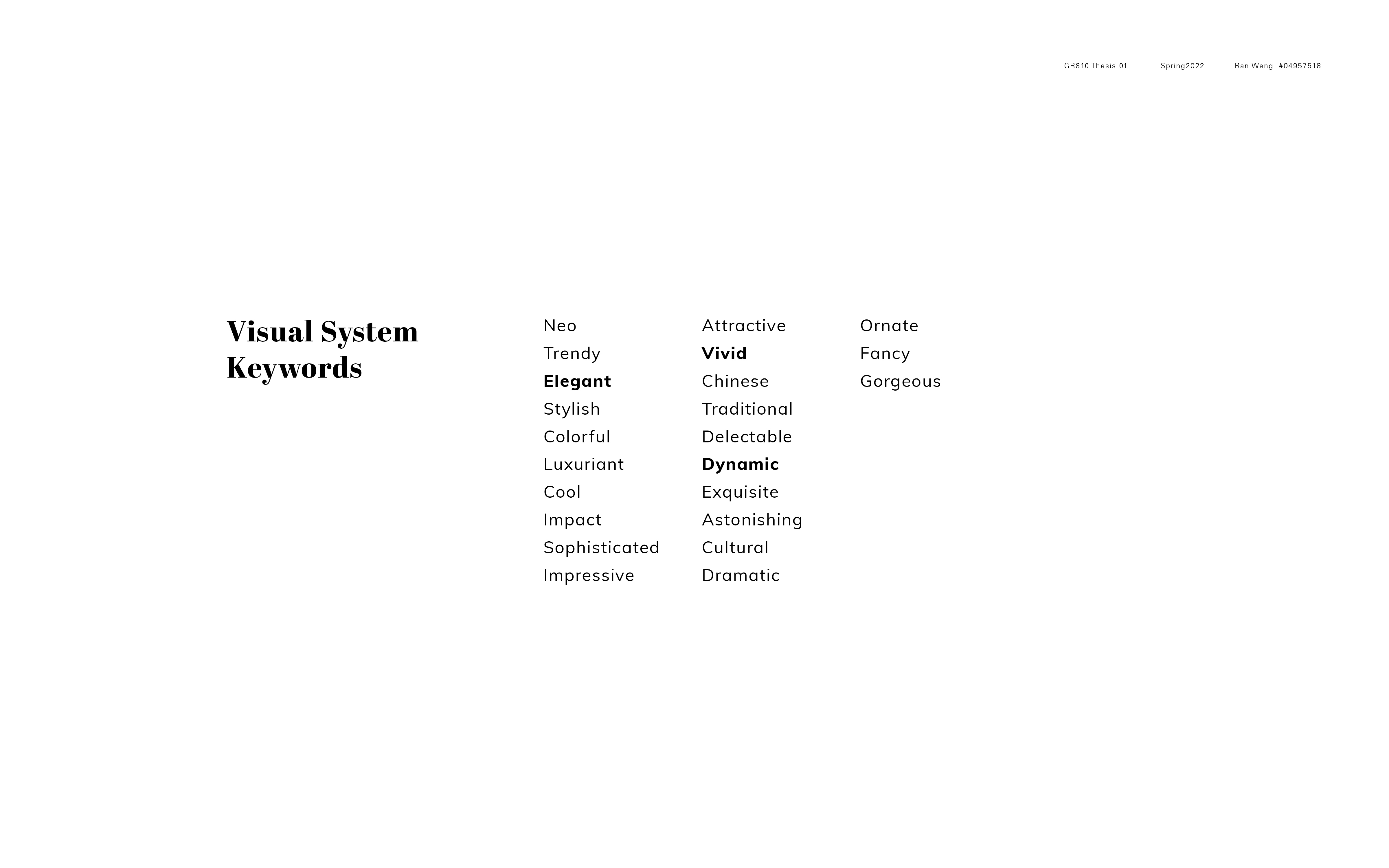
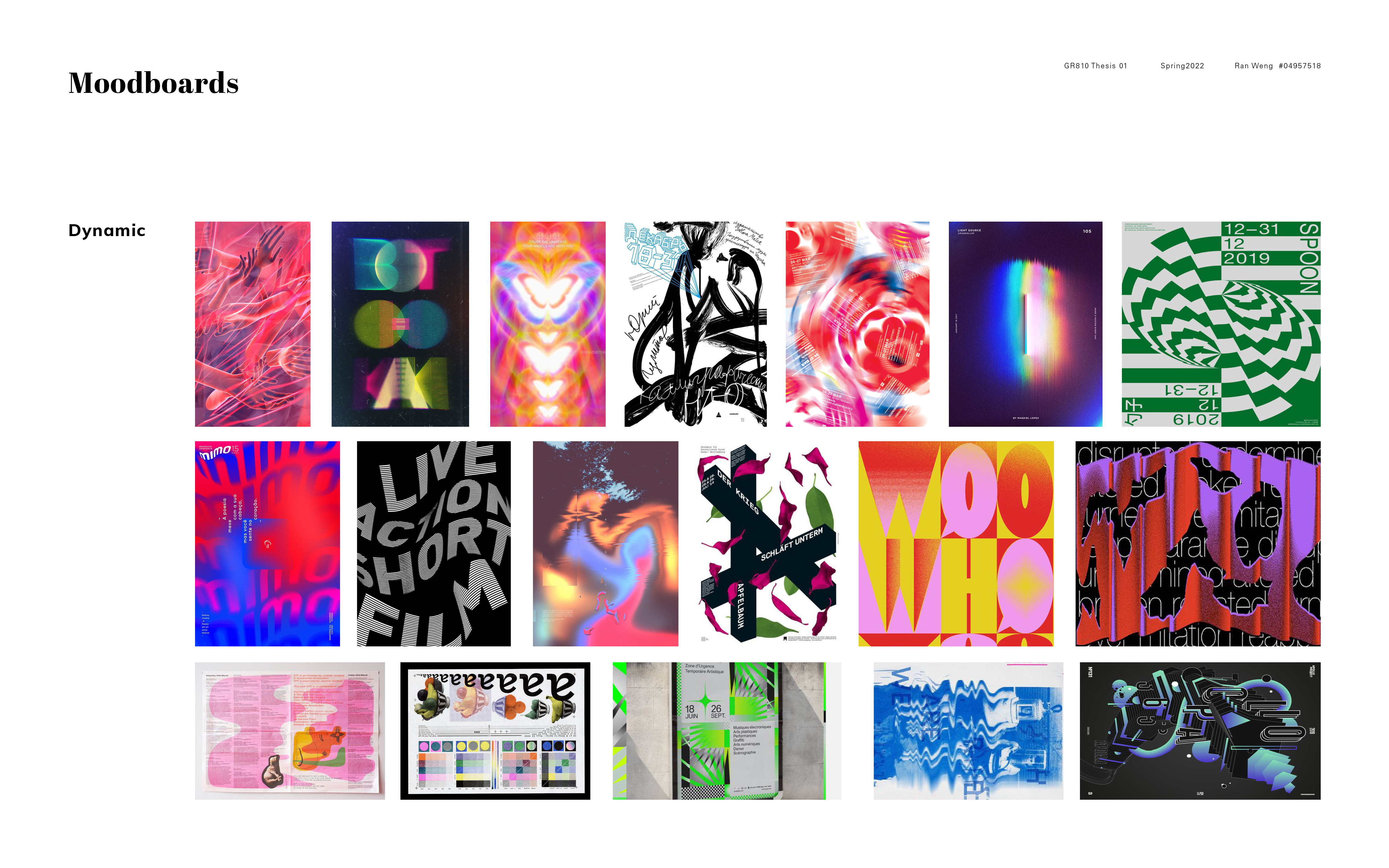
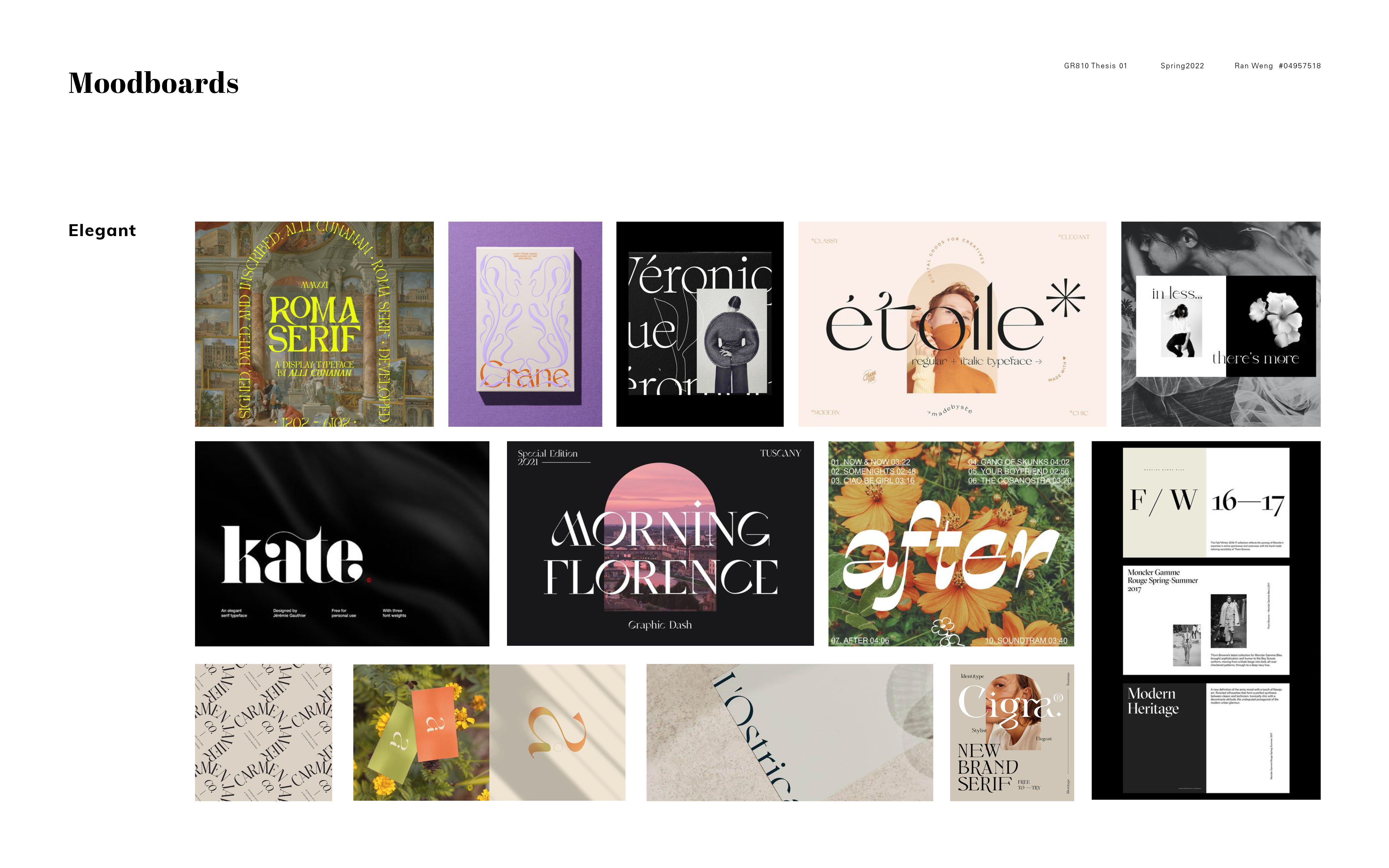
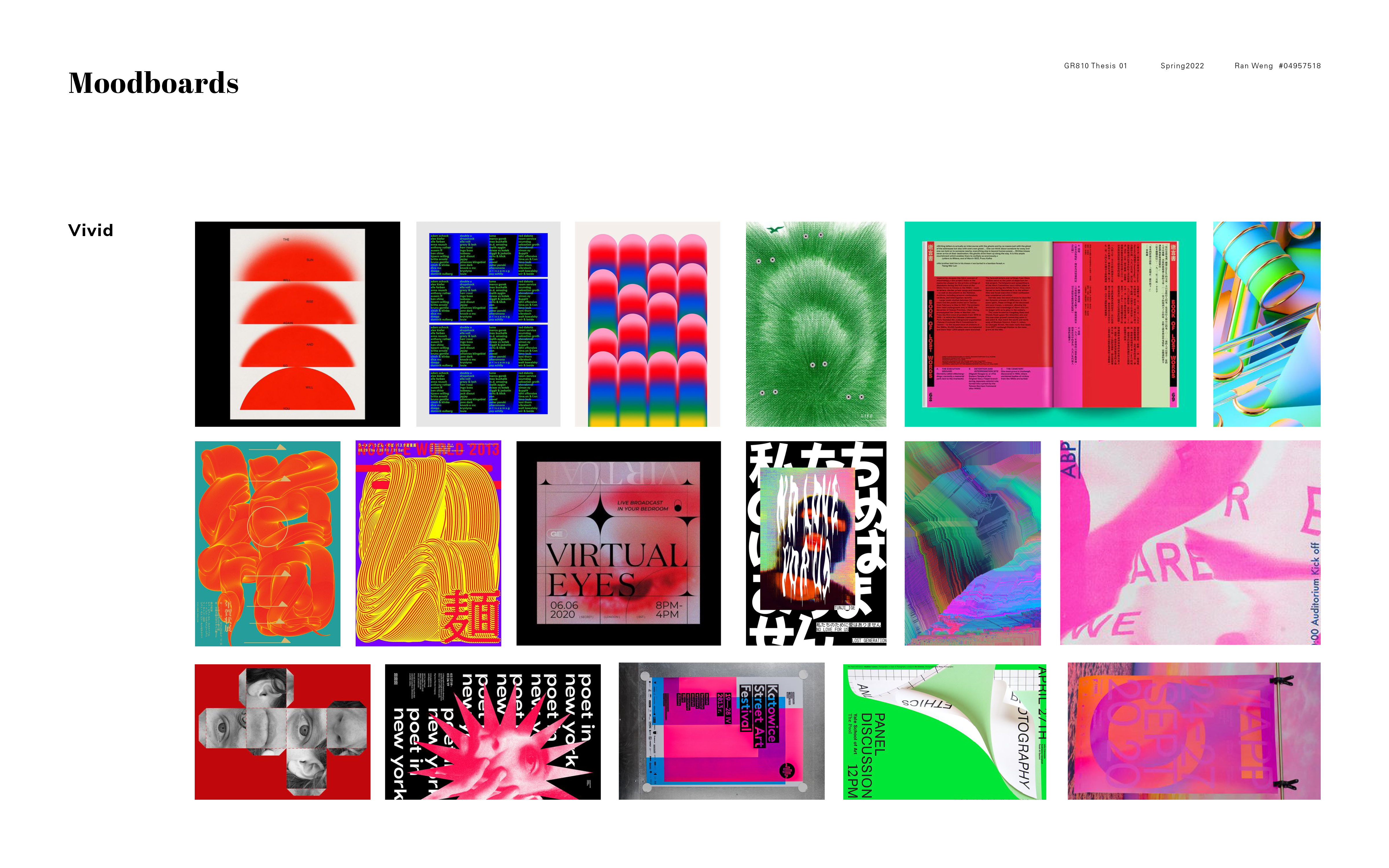
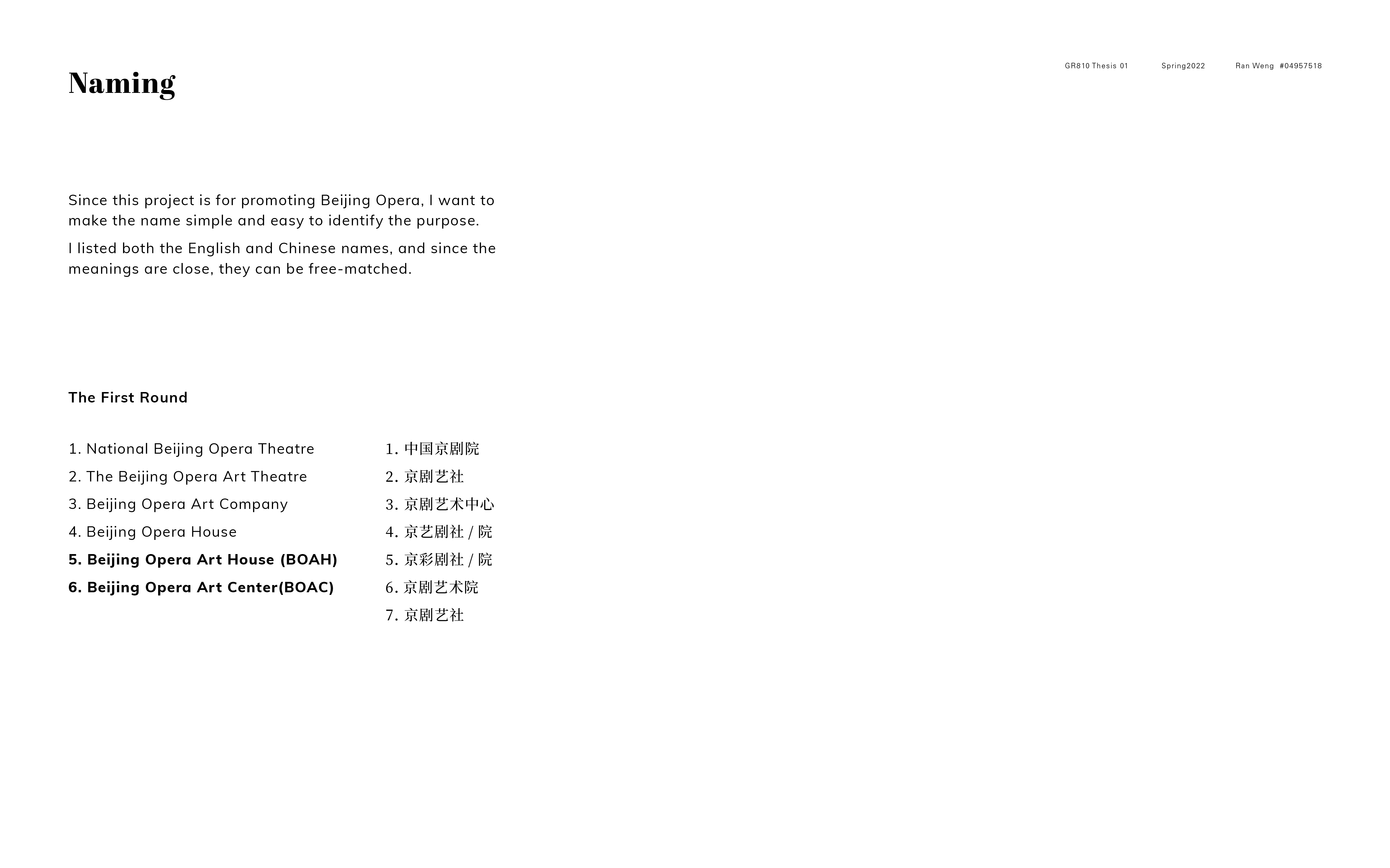
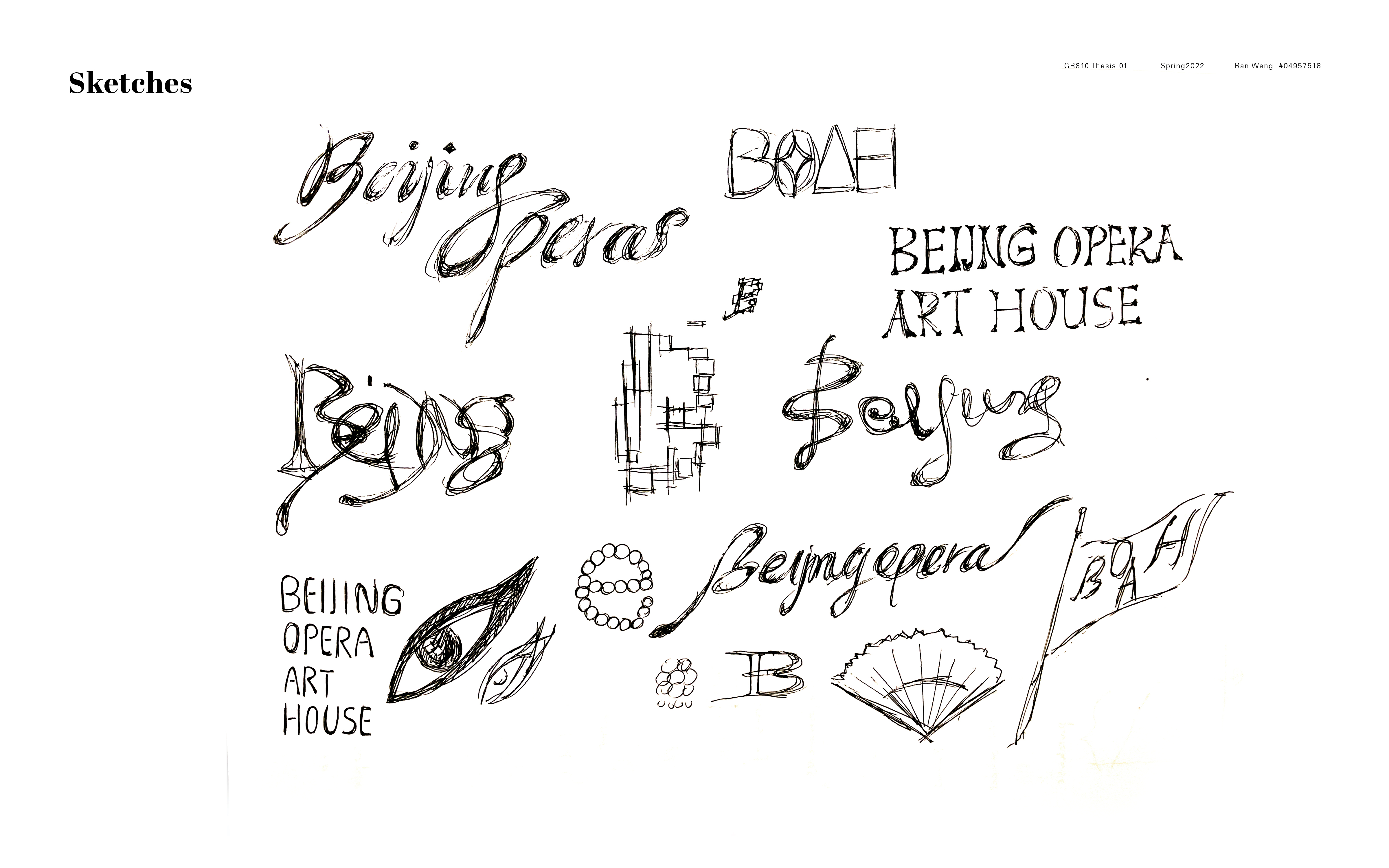
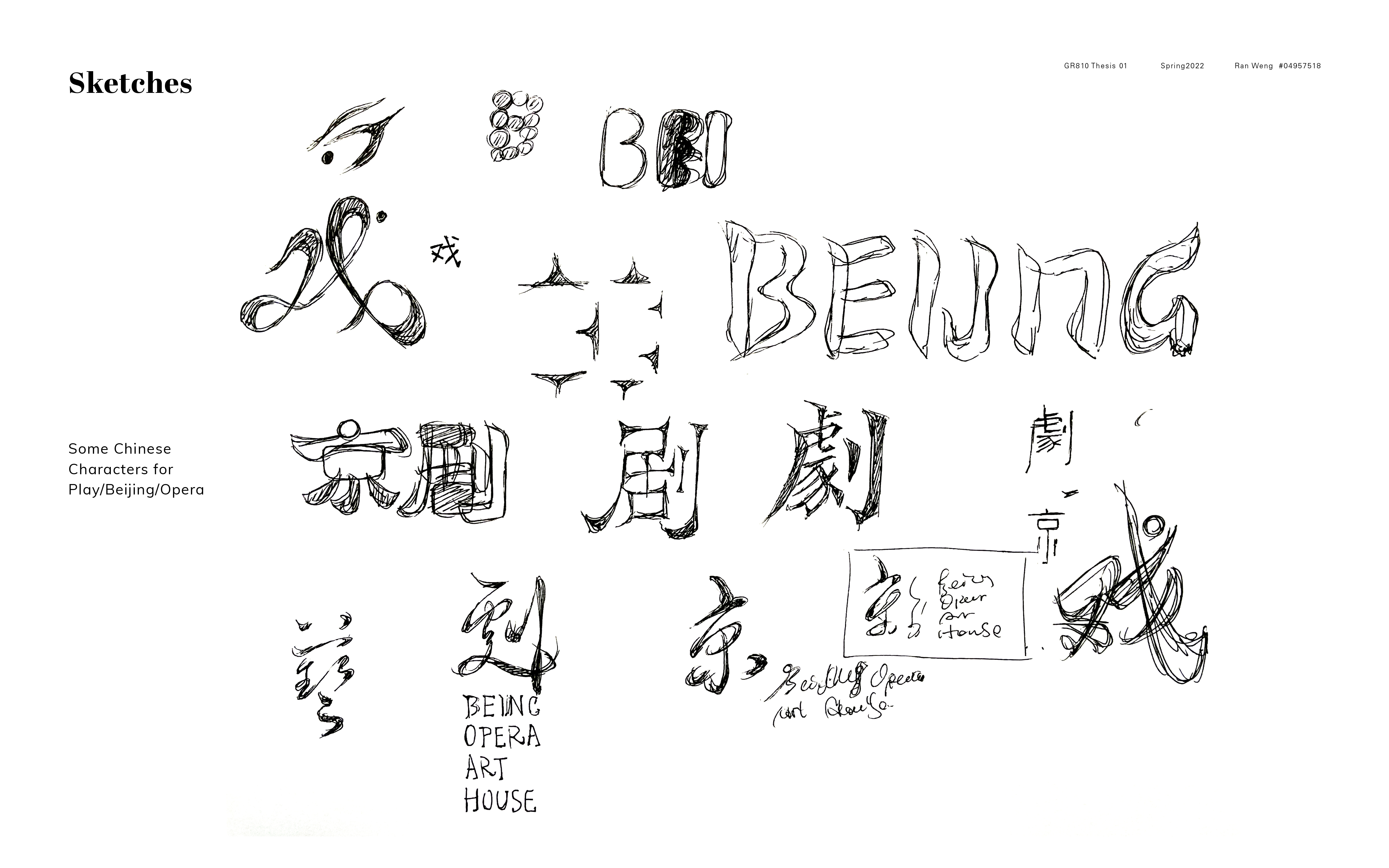
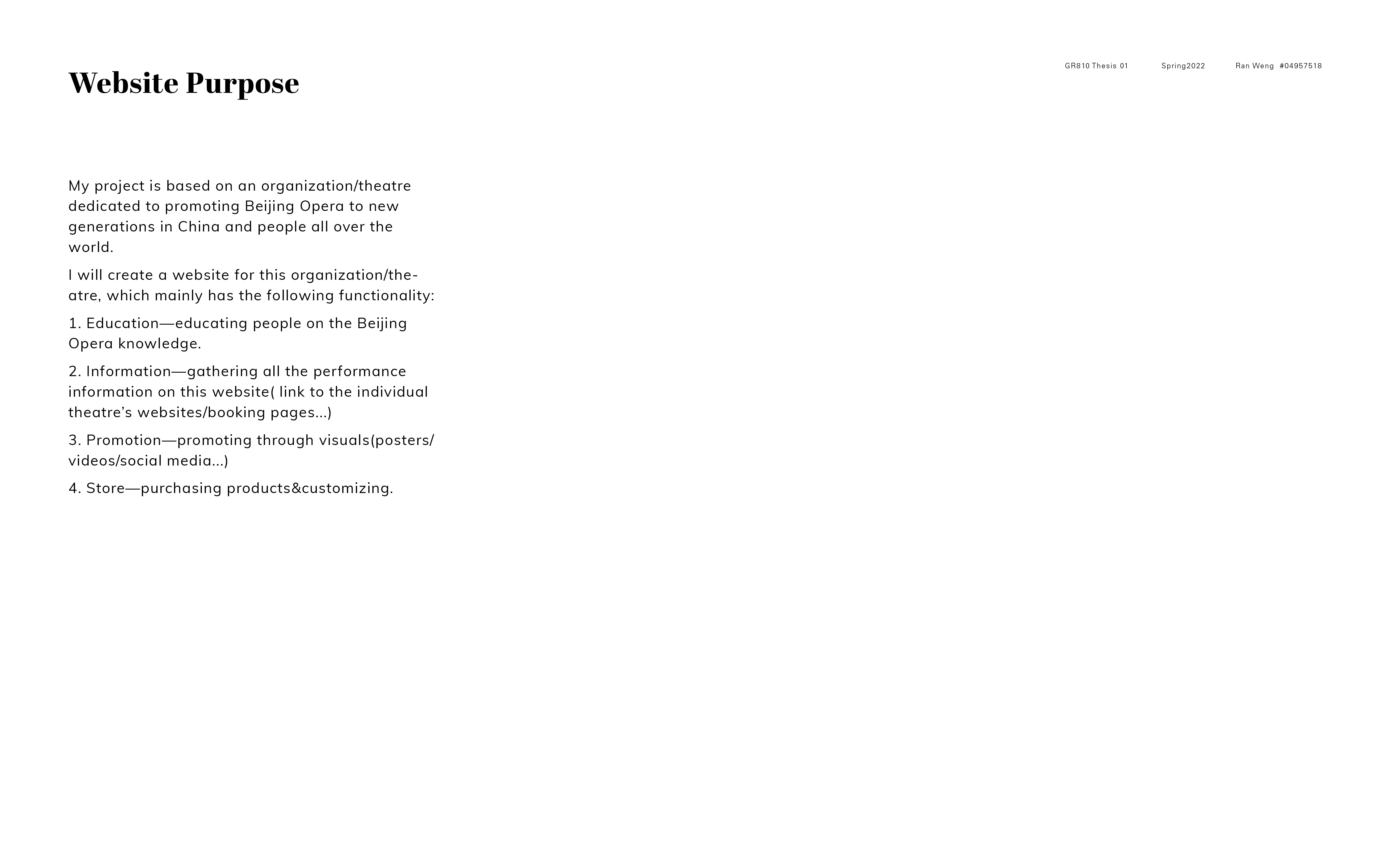
This week I start with refining my mood boards and looking for inspirations for the visual system. Since this project is for promoting Beijing Opera, I want to make the name simple and easy to identify the purpose. So I include the word"Beijing Opera" in all the names. I listed both the English and Chinese names, and since the meanings are close, they can be free-matched. I just need to consider which word is more articulate and sophisticated to be the brand name. I sketched both the English letters and Chinese characters and tried to make them a pair. For the brand logo, I want to show Beijing Opera's elegance but avoid the old-fashion stereotypes. It is a challenge for me to keep the elegance and modern feel at the same time. I still need to refine those serif typefaces.
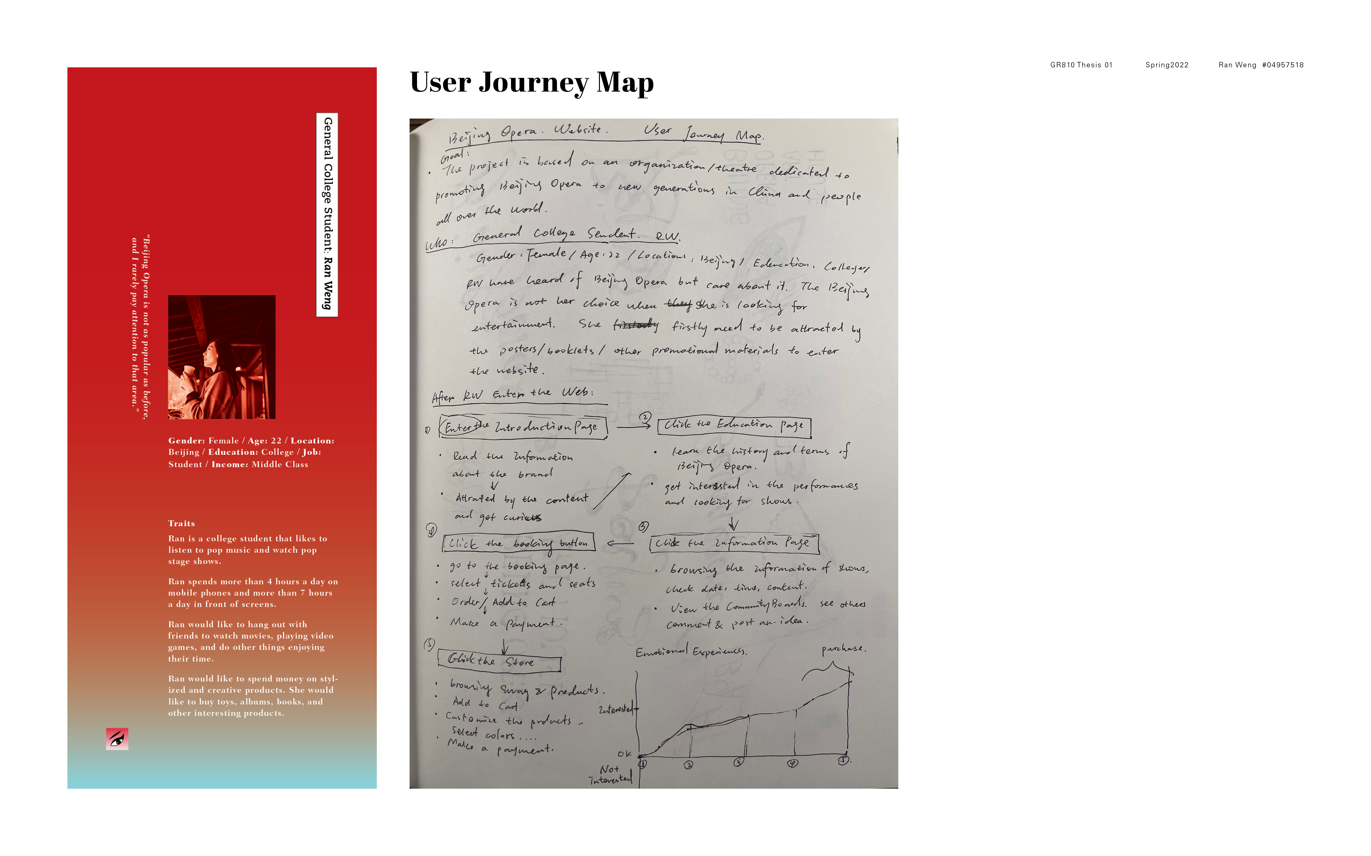
Then I drew the user journey map. It is very helpful to figure out how the users will use the website and what they expect when browsing it.
