WEEK 11
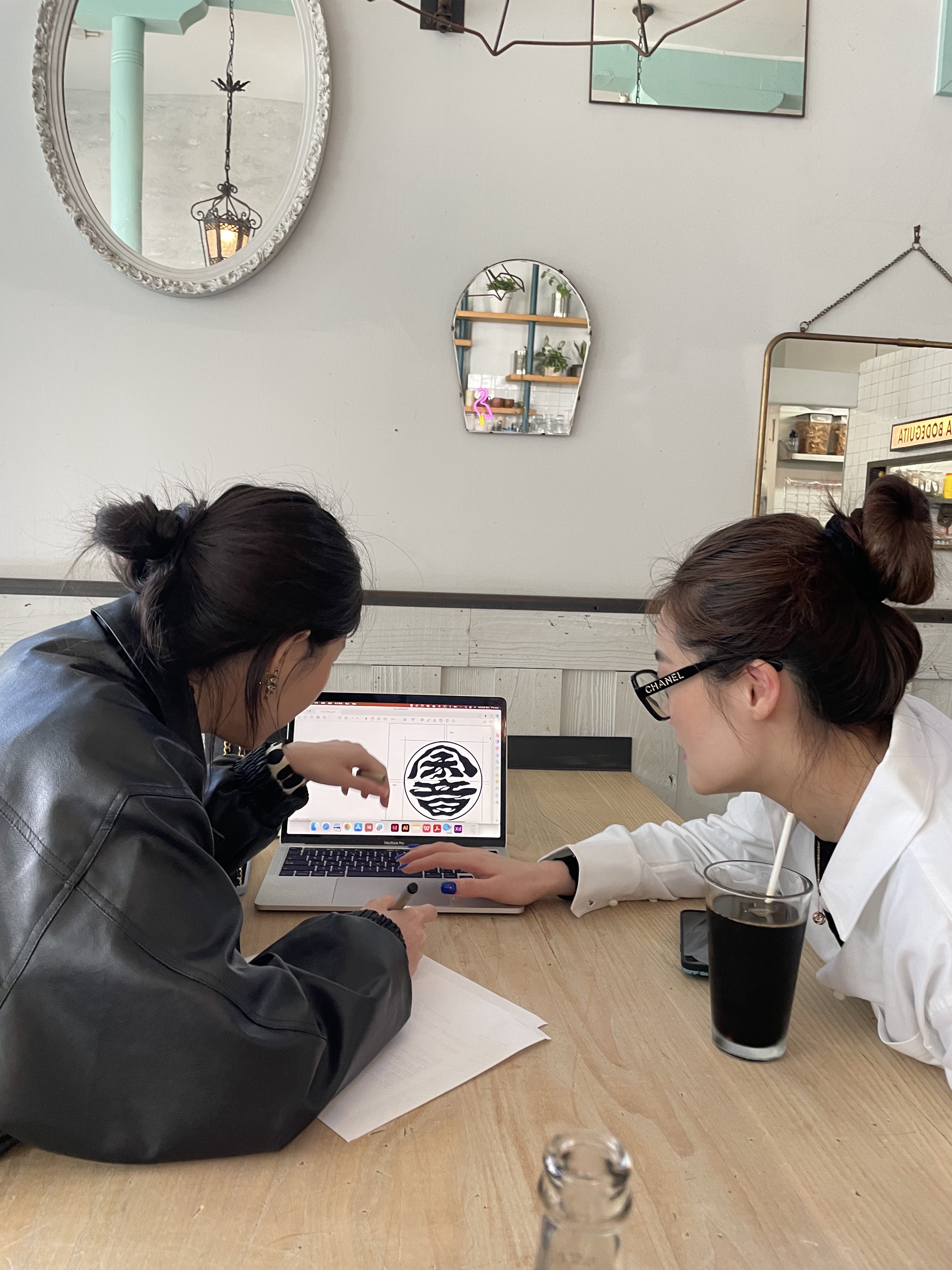
This week I conducted user testing and refined the project based on the feedback and opinions. I interviewed a few people and collected some helpful information and suggestions.
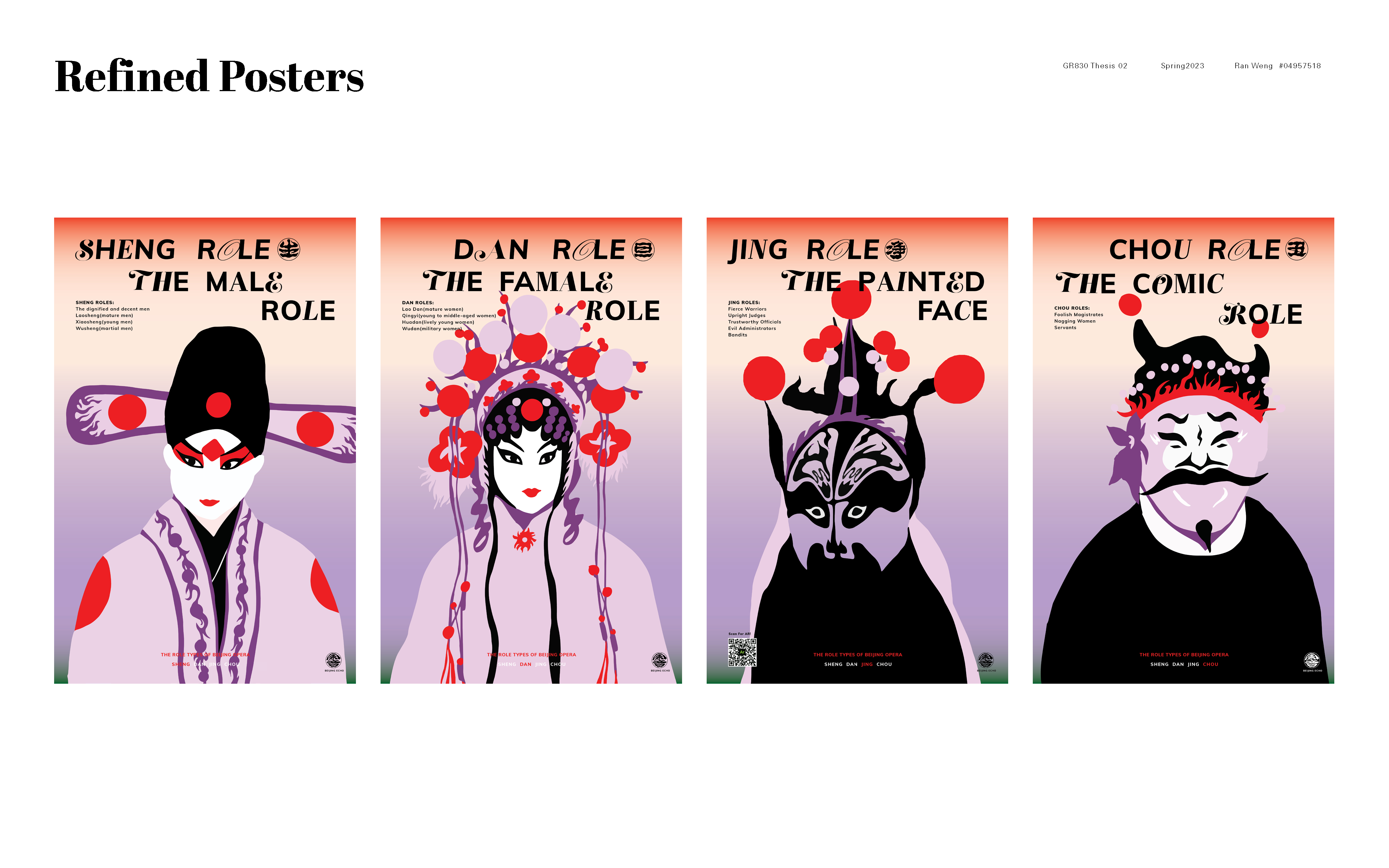
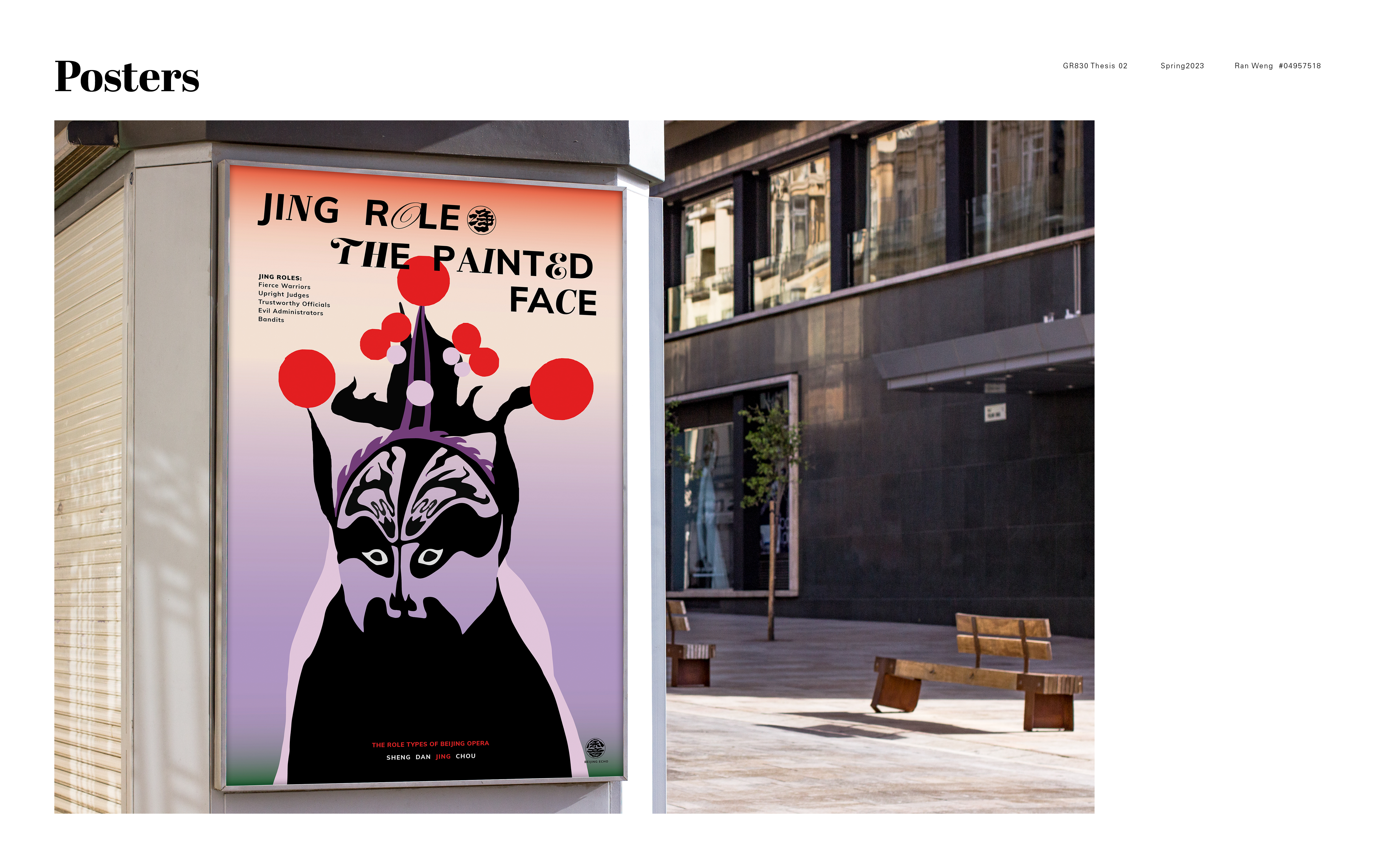
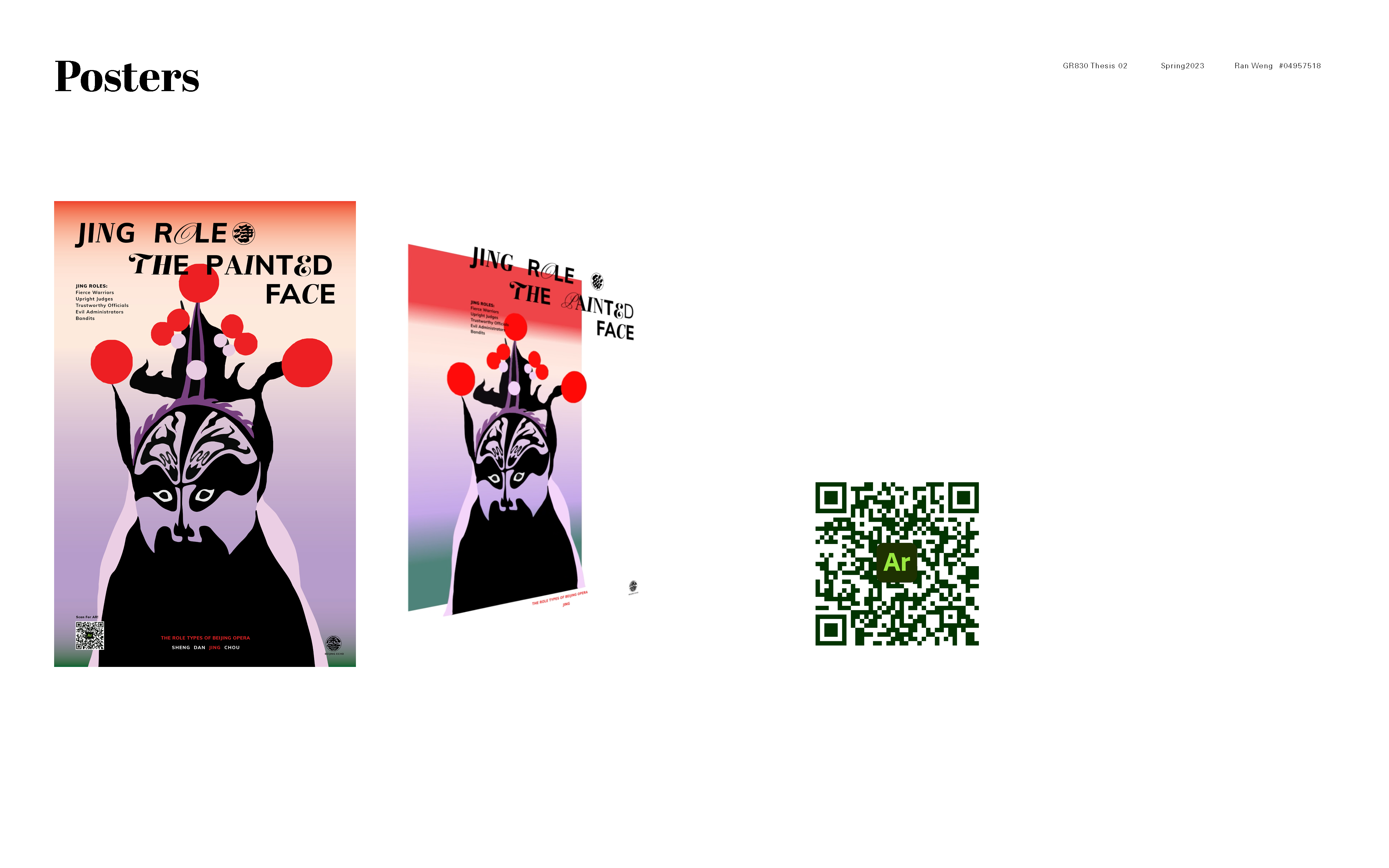
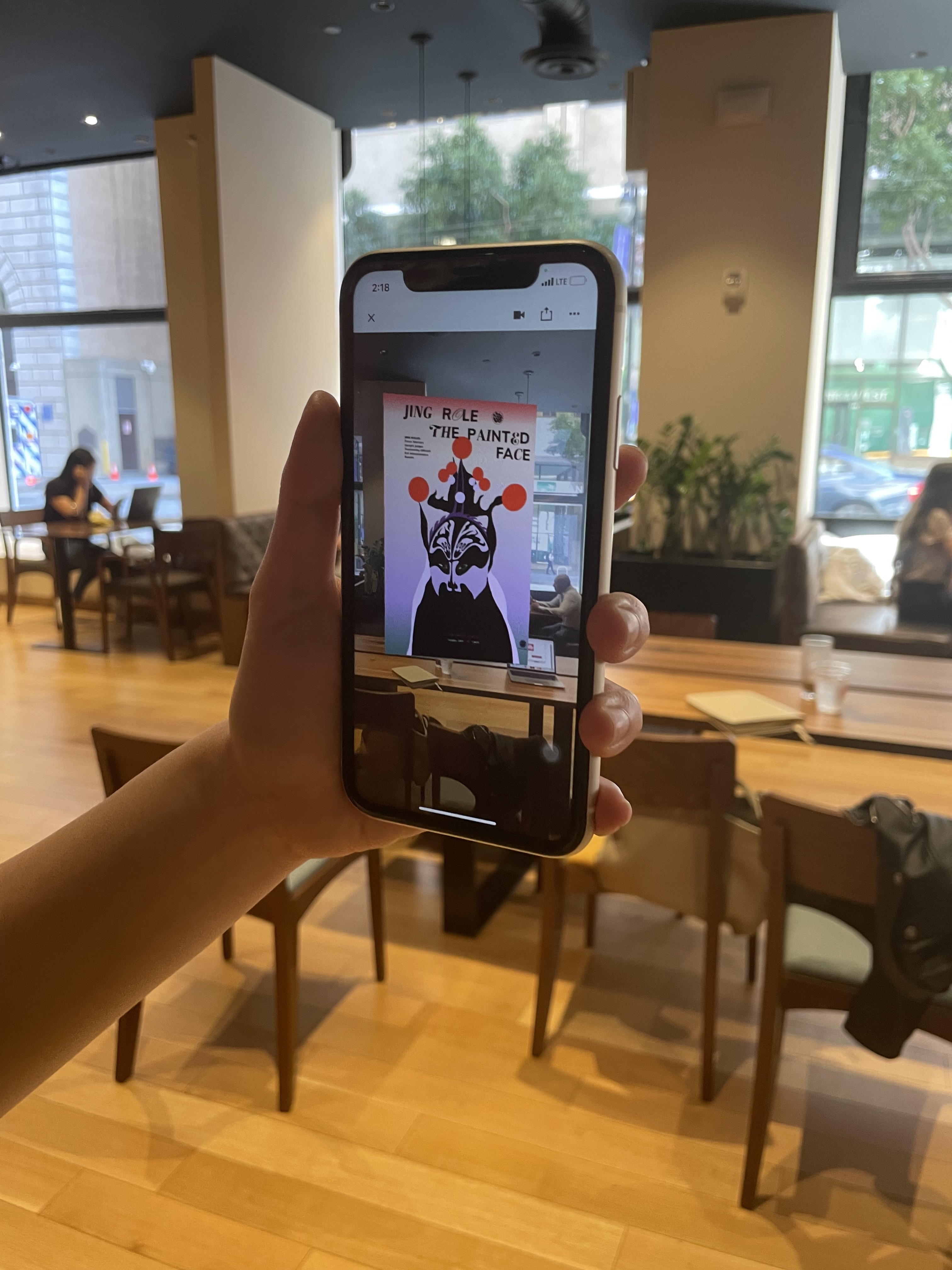
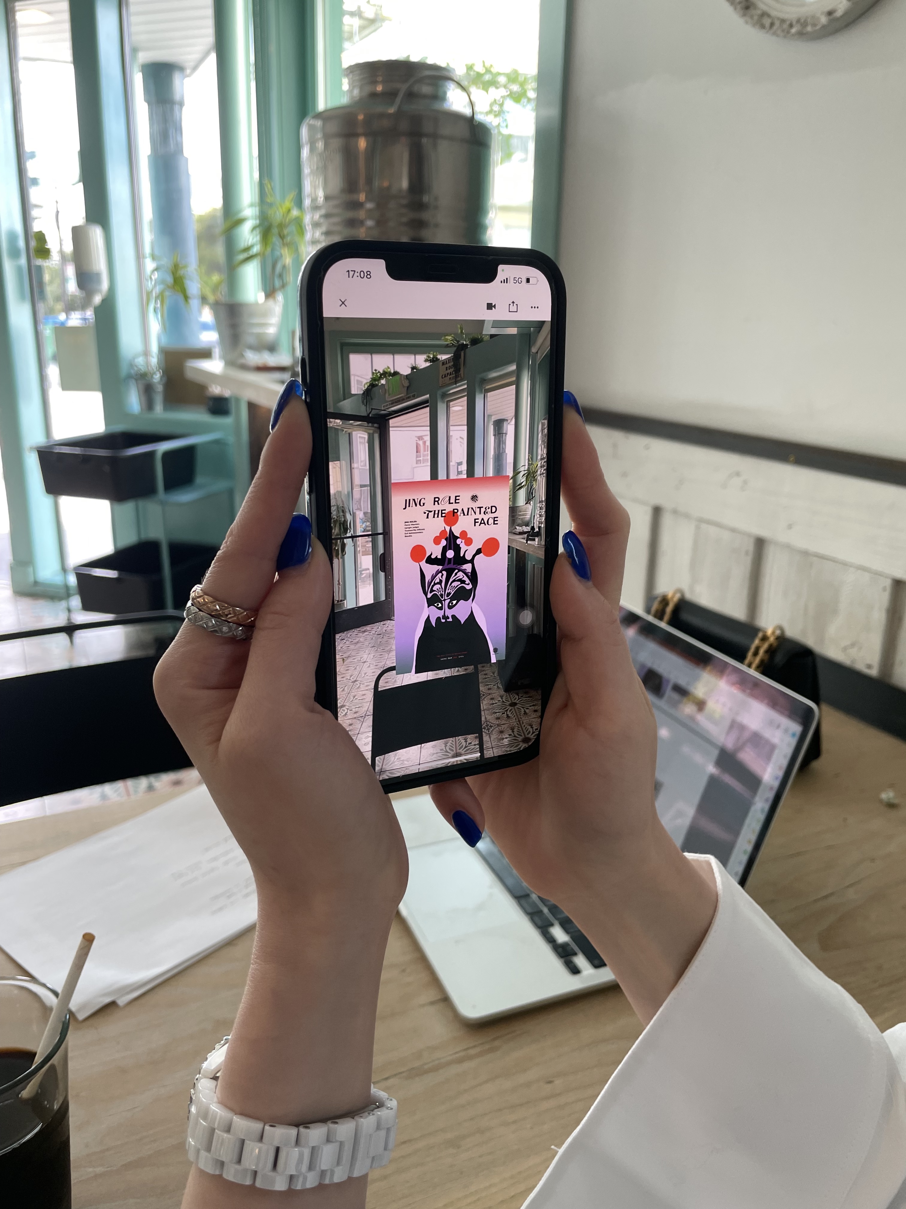
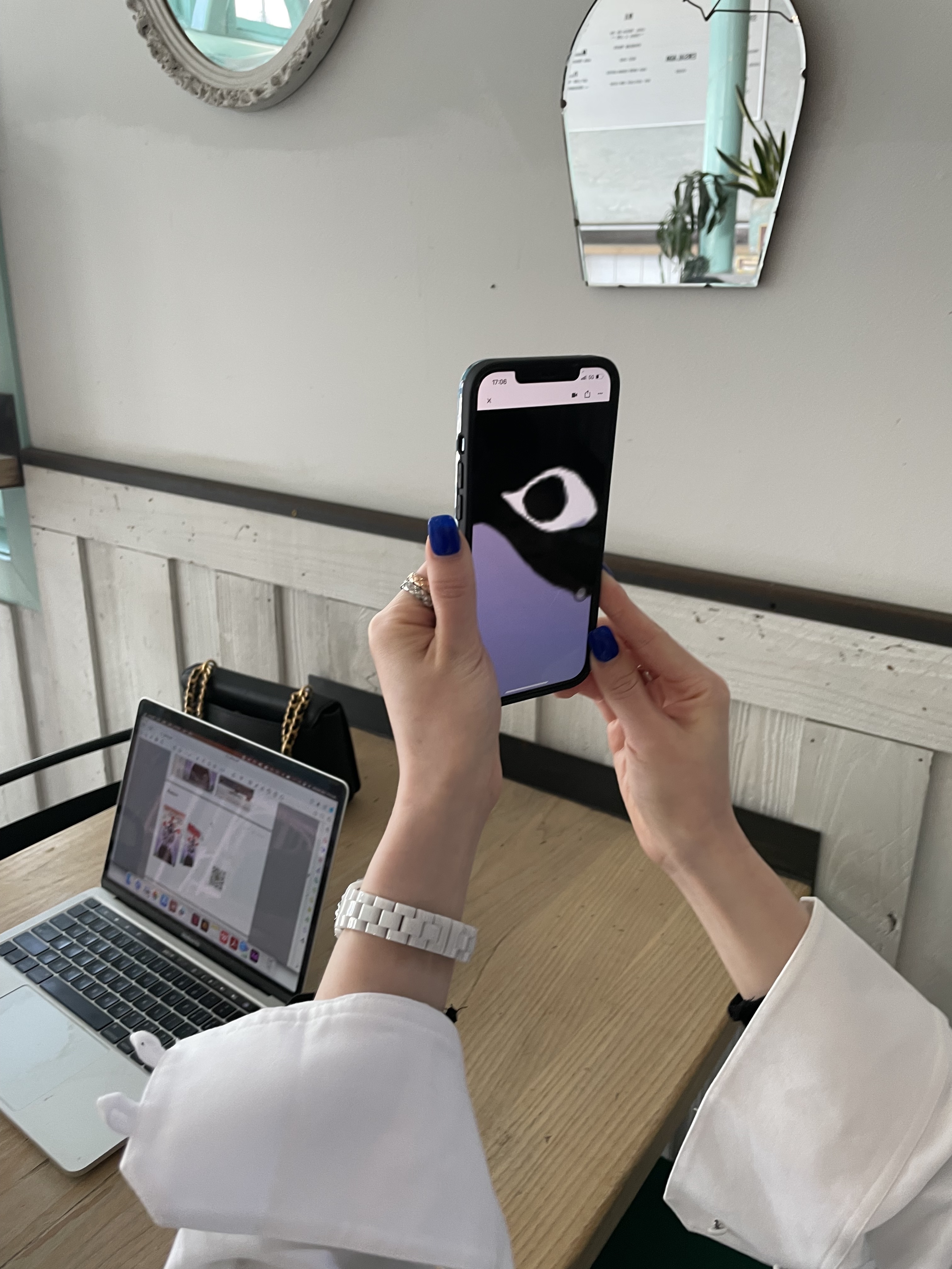
The first is the AR poster. Some of the participants met the poster size problem that when they selected a table as a surface, the poster showed up on a very large scale and they had to stand up and walk far to see the full poster. We discussed the pros and cons of a big poster. The disadvantage is people may not be able to find a correct surface to see the poster and lose their patience. The ideal surface is an empty ground, not a table. But the good side is bigger posters are indeed stronger and more impressive. So eventually I'd stick to the big ones. Another concern is the type and logo at the bottom are hard to see. You have to squat down to read the text. So I need to move the type upward. Or I am thinking maybe designing two versions of the poster, one is for printing and one is for digital AR animations. There are also suggestions about the animations. One of the participants suggested that there could be more layers of the poster. Because right now if you see the poster from a distance, you won't be able to know that it has layers. It just looks flat. There could also be tapping interactions added to the posters. I will continue to explore the color variations and animations.
The first is the AR poster. Some of the participants met the poster size problem that when they selected a table as a surface, the poster showed up on a very large scale and they had to stand up and walk far to see the full poster. We discussed the pros and cons of a big poster. The disadvantage is people may not be able to find a correct surface to see the poster and lose their patience. The ideal surface is an empty ground, not a table. But the good side is bigger posters are indeed stronger and more impressive. So eventually I'd stick to the big ones. Another concern is the type and logo at the bottom are hard to see. You have to squat down to read the text. So I need to move the type upward. Or I am thinking maybe designing two versions of the poster, one is for printing and one is for digital AR animations. There are also suggestions about the animations. One of the participants suggested that there could be more layers of the poster. Because right now if you see the poster from a distance, you won't be able to know that it has layers. It just looks flat. There could also be tapping interactions added to the posters. I will continue to explore the color variations and animations.
